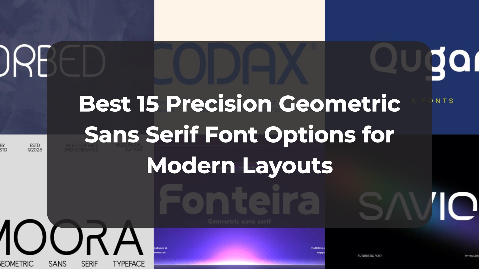
Best 15 Precision Geometric Sans Serif Font Options for Modern Layouts
Finding the perfect balance between clinical precision and artistic character is the holy grail of modern typography. Over years of client work, I’ve found that a robust Geometric Sans Serif Font is the absolute backbone of a clean layout. Here are 15 of my favorite powerhouse picks that drop perfect mathematical balance and contemporary authority right onto your design artboard.
1. Fonteira Geometric Sans Serif Font


Every designer knows the struggle of looking for a typeface that feels incredibly premium without coming across as cold or distant, which is why Fonteira immediately caught my eye. This Geometric Sans Serif Font is an absolute masterclass in clean, contemporary design, hitting that rare sweet spot between welcoming approachability and sharp, professional polish. It strips away all the unnecessary visual clutter, leaving you with beautifully balanced letterforms that instantly elevate the overall mood of a digital canvas.
When it comes to real-world applications, dropping this Geometric Sans Serif Font into a layout brings an undeniable sense of sophistication to high-end projects. I find it to be an incredible, go-to asset for tech startups looking to establish immediate digital trust, luxury branding that demands understated elegance, or sleek editorial spreads where structural clarity is everything. It is a brilliant, versatile tool to have in your archive when you want your typography to look high-end, deliberate, and perfectly tailored to the modern landscape.
2. Codax Geometric Sans Serif Font


There is a really fine line between looking cutting-edge and looking completely unreadable, but Codax is a Geometric Sans Serif Font that walks that tightrope flawlessly. It pairs a clean, futuristic aesthetic with rounded shapes that instantly soften what could otherwise be a sterile design. Built with absolute simplicity and precision, this typeface drops a sleek, incredibly modern tone right onto your artboard while keeping readability at an absolute premium.
What makes this specific Geometric Sans Serif Font such a reliable choice for interactive environments is its bold structure and smooth, friendly curves. I’ve found it to be a fantastic fit for tech startups, UI/UX design, and mobile apps where you need crisp digital branding that doesn’t feel intimidating to the user. It is a genuine must-have asset for any creative archive when the goal is to deliver uncompromised clarity with a distinctively modern, forward-thinking edge.
3. Pimoora Geometric Sans Serif Font


It is always incredibly refreshing to stumble upon a typeface that manages to break away from rigid, robotic lines without losing its structural integrity, and Pimoora does exactly that. This Geometric Sans Serif Font is a fantastic study in blending clean construction with distinctive curved edges and subtle, unique cuts that give it loads of individual character. Instead of feeling cold or overly mathematical like some traditional grids, it delivers a beautifully refined balance that adds instant personality to an artboard while keeping your text perfectly legible.
From a practical workflow perspective, having a Geometric Sans Serif Font packed with creative ligatures, stylistic alternates, and full multilingual support is a total lifesaver for handling international branding and global communication. It scales beautifully across different mediums, making it just as effective for high-end fashion campaigns and client presentations as it is for complex UI/UX systems and digital tech platforms. If your personal archive needs a versatile powerhouse that brings a modern, highly polished edge to everything from social media graphics to corporate identities, Pimoora is well worth the install.
4. Orbed Geometric Sans Serif Font


There is nothing quite like the feeling of opening a brand-new type family and realizing it has enough depth to carry an entire branding project on its own, and that’s exactly the kind of excitement Orbed brings to the table. As a precision-engineered Geometric Sans Serif Font collection, it beautifully merges strict mathematical symmetry with a sense of pure, modern elegance. With six highly versatile styles ranging from whisper-thin italics to high-impact bold weights, it gives you a clean, “smart,” and undeniably high-end look that completely redefines what a basic grid-based typeface can do.
What really sets this Geometric Sans Serif Font family apart in a crowded marketplace is the inclusion of its unique “Curve” and “Round” iterations, which instantly soften the traditional geometric lines for a more approachable, human touch. I love having this level of flexibility in my creative toolkit because it means I can seamlessly pivot from the razor-sharp layouts required by fast-paced tech startups to the editorial sophistication demanded by luxury fashion houses. It is a complete, beautifully curated typographic solution that makes it incredibly easy to maintain a cohesive visual identity while playing with different structural textures on the canvas.
5. Qugan Geometric Sans Serif Font


Finding a font that feels equally suited for a high-end luxury fashion label and a heavy-duty architectural firm is a rare find, but Qugan handles that exact challenge with incredible ease. This Geometric Sans Serif Font strikes a flawless balance between rigid technical precision and approachable minimalism, giving your text an immediately sophisticated, modern edge. It strips away all the unnecessary visual noise, allowing the pure, clean structure of the letters to create a confident brand identity that feels perfectly aligned with the modern era.
One of my favorite things about integrating this Geometric Sans Serif Font into my daily design workflow is the sheer flexibility offered by its six distinct weights. Having access to a full range of weights makes mapping out a seamless visual hierarchy across websites, corporate logos, and premium packaging incredibly smooth. Whether I am pairing its cleaner weights with a high-contrast serif for a trendy, contemporary editorial vibe or letting it stand completely alone for a bold, industrial statement, Qugan delivers a level of versatility that makes it an absolute keeper.
6. Savior Geometric Sans Serif Font


If your current artboards are starting to feel a bit too safe and you need a typeface that practically vibrates with forward-thinking energy, Savior is an absolute must-see. This cutting-edge Geometric Sans Serif Font breaks away from conventional structures by introducing highly unique cuts and precise curves that give off a massive advanced-technology vibe. It masterfully pulls off a clean, techno-futuristic aesthetic, making it an instant favorite for those moments when you want your layout to look like it was beamed straight out of the next decade.
From a practical standpoint, keeping a highly specialized Geometric Sans Serif Font like this in your back pocket is a total lifesaver when next-gen tech clients come knocking. I’ve found its sharp structure fits seamlessly into visual identity concepts for AI startups, sleek mobile applications, and user interfaces for wearable devices where every single pixel needs to feel intentional. Whether you are building a bold digital corporate brand or setting up crisp headers for a tech platform, Savior brings a commanding, ultra-modern presence to the screen that refuses to be ignored.
7. Festorica Geometric Sans Serif Font


Sometimes you don’t want a layout to whisper; you want a typeface that steps onto the stage and completely takes over the room, which is exactly why Festorica instantly made it onto my radar. It is a bold, all-caps Geometric Sans Serif Font that perfectly balances a rock-solid mathematical backbone with a raw, effortless confidence. With its ultra-sleek lines and sharp, crisp edges, it brings an unmistakable sense of authority to any artboard, acting as the ultimate minimalist tool for projects that need to make a massive impact without looking cluttered.
What I love most about working with this particular Geometric Sans Serif Font is how it manages to command attention while remaining flawlessly professional. Because it is purely all-caps and built on such a precise structural foundation, it acts like that favorite black T-shirt in your closet—it just goes with everything. Whether I’m dropping it into a high-tech app interface, a luxury branding suite, a sleek logo, or a massive billboard layout that needs to steal the show, Festorica delivers a stylish, assertive voice that refuses to be ignored.
8. Ethere Geometric Sans Serif Font


Just when I thought I had seen every possible variation of minimalist typography, Ethere came along and completely flipped the script. This gorgeous Geometric Sans Serif Font is a masterclass in clean architectural proportions, built with smooth rounded terminals that instantly soften its structured frame. While it reads as wonderfully understated and minimal at a first glance, a closer look reveals an expressive, soulful depth that is incredibly rare for a traditional, grid-based typeface.
What makes this particular Geometric Sans Serif Font an absolute powerhouse for my branding projects is the inclusion of its unique, romantic script-style alternates. Dropping these fluid characters into an otherwise rigid layout introduces a beautiful sense of movement and elite elegance without disrupting the underlying geometry. It is the ultimate design asset for identity systems, chic packaging, or editorial headers that demand absolute functional clarity alongside a deeply personal, unforgettable signature.
9. Hulira Geometric Sans Serif Font


If you are tired of the same old uniform blocks of text and want a typeface that brings a serious structural edge to your artboards, Hulira is an absolute game-changer. This Geometric Sans Serif Font immediately stands out from the crowd thanks to its intentional gaps and beautifully calculated letterforms that radiate high-tech innovation. It completely embraces negative space within its layout, transforming standard typography into a cutting-edge piece of visual architecture that feels both incredibly precise and effortlessly cool.
In my own creative routine, keeping an expressive Geometric Sans Serif Font like this on hand is an absolute lifesaver when a project demands an aggressive, unforgettable visual presence. It performs brilliantly across digital interfaces and physical apparel alike, making it the ultimate asset for disruptive tech startups, high-energy gaming branding, or streetwear labels looking for a raw, industrial vibe. Dropping Hulira into your workflow means you’ll always have a reliable way to make a bold statement that feels entirely rooted in the future.
10. Digittal Geometric Sans Serif Font


There is a massive influx of tech-focused typography out there, but finding one that truly captures the heartbeat of digital advancement without looking like a total cliché is a serious win. That’s exactly why Digittal earned a spot on my radar. This Geometric Sans Serif Font is built with absolute geometric precision and incredibly sharp angles, giving your layouts a sleek, futuristic vibe right out of the box. It manages to feel both incredibly clean and deeply innovative, perfectly encapsulating what next-gen digital design should look like.
In my everyday design routine, having a highly specialized Geometric Sans Serif Font like this is a massive asset when mapping out cutting-edge branding projects. It works beautifully as a standout logo font, making it an ideal choice for tech startups, sleek app logos, and high-energy gaming titles. Whether I’m diving into a complex UI/UX design or crafting promotional assets for digital products, Digittal brings that sharp, uncompromising edge that immediately signals technical advancement to the viewer.
11. Mebula Geometric Sans Serif Font


When a project calls for absolute clarity but a standard text weight just isn’t cutting it, Mebula is the exact kind of heavy hitter I reach for. This Geometric Sans Serif Font delivers a bold, confident presence right out of the gate, combining strong mathematical shapes with an unapologetically powerful aesthetic. It completely avoids the trap of becoming clunky or illegible at larger display scales, striking a perfect balance between high-impact modern styling and clean visual structure that instantly anchors your artboard.
What makes this Geometric Sans Serif Font such a versatile champion in my creative rotation is its natural ability to tackle completely different design mediums without losing its modern edge. It feels right at home anchoring web headers and digital advertising campaigns for tech startups, but it also carries enough visual weight to elevate modern product packaging or sleek mobile interfaces for creative agencies. If you need to inject a sense of raw, contemporary confidence into your next digital layout, Mebula is a massive asset that is always ready to do the heavy lifting.
12. Gormica Geometric Sans Serif Font


There are projects that require a typeface with actual muscle—something that feels structurally bulletproof rather than just visually pleasing—and that is precisely where Gormica shines. This Geometric Sans Serif Font is a total powerhouse built on clean, circular foundations wrapped in high-contrast bold strokes. It radiates a brilliant sense of industrial reliability and modern sophistication, proving that a typeface can be incredibly strong and authoritative while still keeping its overarching aesthetic stylishly minimal.
What makes me keep this Geometric Sans Serif Font at the top of my font manager is how effortlessly it commands a page without compromising on absolute readability. I’ve found it to be an absolute dream asset when building bold visual identities for heavy machinery branding, architectural portfolios, or tech startups that need a rock-solid, confident voice. If you’re looking to give your contemporary layouts a grounded, high-precision edge that demands respect, dropping Gormica into your creative workflow is an easy win.
13. Megib Geometric Sans Serif Font


Every once in a while, a project comes along that requires you to throw subtlety out the window and roll out the absolute heaviest visual artillery in your archive. That is precisely the moment I pull out Megib. This ultra-bold Geometric Sans Serif Font is engineered for maximum visual impact, featuring tight apertures that create a commanding, almost indestructible “wall of text” effect on the artboard. It strips away any delicate hesitation, replacing it with a flawless silhouette of pure structural strength that instantly anchors a contemporary layout.
What keeps me experimenting with this powerhouse Geometric Sans Serif Font is how beautifully its massive weight translates across both digital screens and physical print without losing its crisp, professional edge. I’ve found it to be an absolute dream asset for loud hero banners, bold logo marks, and high-visibility environmental graphics, especially when I’m designing for fitness brands, urban streetwear labels, or tech startups wanting to project pure innovation. Whether you drop it into a vibrant modern gradient or let it sit alone in a stark black-and-white composition, Megib acts as a total workhorse that ensures your message is completely impossible to ignore.
14. Garten Geometric Sans Serif Font


Lately, I’ve been obsessing over typefaces that effortlessly mix a heavy, industrial structure with subtle, unexpected quirks, and Garten hits that sweet spot perfectly. This Geometric Sans Serif Font introduces a fascinating take on clean design by balancing its bold, modern minimalism with beautifully approachable curves. Built on a rock-solid foundation, it features brilliant “ink-trap” inspired details and softened corners that prevent the heavy letterforms from feeling clinical, giving your artboards an ultra-contemporary look that still feels refreshingly human.
When you need to command an entire page without sacrificing a premium, high-end aesthetic, dropping this Geometric Sans Serif Font into your headers or logotypes is an absolute game-changer. I can easily see it anchoring the visual identity for an innovative architecture firm, a disruptive tech startup, or a boutique lifestyle brand that requires a sophisticated yet friendly digital presence. Its massive weight and flawless geometry ensure it delivers maximum visual impact, making it a stellar addition to your creative rotation whenever you want your typography to look deliberate, confident, and cutting-edge.
15. Vetro Geometric Sans Serif Font


If you’ve been searching for a display face that treats typography less like a standard set of letters and more like modular architecture, Vetro is going to absolutely blow you away. This striking, all-caps Geometric Sans Serif Font completely redefines modern minimalism by leaning into high-impact structural forms and pristine lines. It’s built entirely for visual identities that require absolute architectural clarity, using sharp edges and beautifully balanced negative space to turn a simple layout into a self-contained piece of contemporary art.
What really makes me want to drop this Geometric Sans Serif Font into my branding projects is the surprising collection of interlocking ligatures that connect characters in totally unexpected, fluid ways. The unique “V” and “T” connection, for instance, forms a continuous, unbroken line that instantly communicates a sense of connectivity and forward-thinking design. It works like an absolute charm for oversized editorial headlines, sleek digital spaces, or luxury storefront branding where you want the typography to make a loud, confident statement while maintaining an incredibly sophisticated silhouette.
Conclusion
At the end of the day, picking the right Geometric Sans Serif Font comes down to finding that perfect intersection of structure and soul. Whether you’re scaling up a bold tech logo or mapping out complex UI design, these 15 curated options offer the exact structural precision your hierarchy needs. Keep experimenting with your grids and let these bold shapes do the talking.