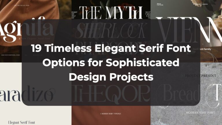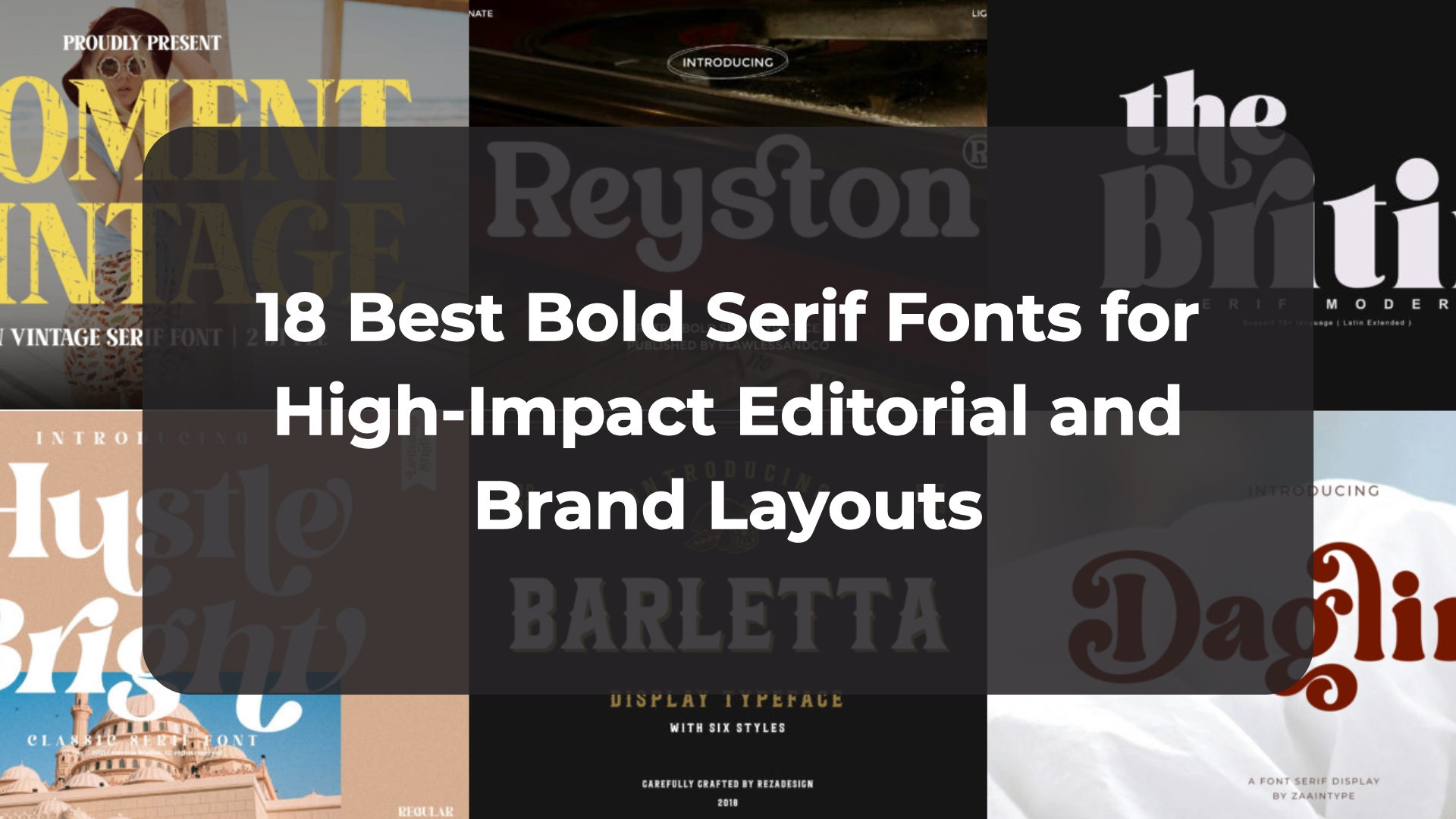
18 Best Bold Serif Fonts for High-Impact Editorial and Brand Layouts
Staring at a blank canvas trying to find typography with real impact can be completely exhausting. That is exactly why I have spent days curating this personal list of my favorite heavy design assets. In this post, I am sharing 18 incredible options to help you choose the ultimate bold serif font for your next high-end layout, ensuring your headlines look both commanding and beautifully sophisticated.
1. Glypster Bold Serif Font


When a branding project demands an undeniable presence that effortlessly commands the room, my go-to choice is always a typeface with real weight. That is why the Glypster Bold Serif Font has completely stolen my attention lately. This magnificent bold serif font packs a serious aesthetic punch, expertly blending thick, robust lines with subtle, elegant curves. The main advantage here is its unique versatility; it simultaneously channels a luxurious, high-end retro vibe and a modern, confident energy. Its balanced simplicity makes your headers look incredibly powerful without feeling cluttered.
My Recommendation: Deploy this striking typeface for premium logos, editorial posters, or high-impact business cards. To let its heavy, retro letterforms truly shine, pair it with a very clean, minimalist sans-serif for your supporting text blocks. Setting its bold lines against a textured concrete or crisp white background creates a sophisticated visual contrast that makes your main message look exceptionally curated, professional, and timeless.
2. Bastro Bold Serif Font


Lately, I find myself leaning away from sterile layouts and right into design assets with a distinct groove, which is how the Bastro Bold Serif Font became my latest obsession. This magnificent bold serif font perfectly bridges the gap between vintage warmth and trendy typography. The main advantage is its laid-back personality; it commands attention while keeping a casual vibe. Plus, it is PUA encoded, so unlocking its custom glyphs and swashes is completely stress-free.
My Recommendation: Use this heavy typeface for apparel branding, bold magazine covers, or social media graphics. To amplify its retro charm, pair its thick lines with a clean, understated sans-serif for secondary details. Setting your text over a warm terracotta or deep olive backdrop creates a beautiful visual contrast that makes your layout look perfectly curated, stylish, and professional.
3. The Thesla Ohago Bold Serif Font


If you want to give your next layout a serious dose of high-end character, look no further. The Thesla Ohago Bold Serif Font is a masterclass in combining heavy structural weight with sheer grace. The standout advantage of this beautiful bold serif font lies in its exquisite terminal flourishes and wavy curves. It delivers a rich, vintage prestige that commands attention instantly, yet its balanced structure ensures your titles look smooth, polished, and sophisticated without any visual noise.
My Recommendation: Deploy this striking typeface for premium stationery headers, custom letterheads, or book titles. To make its sweeping lines truly pop, pair it with a very clean, minimalist geometric sans-serif for secondary text blocks. Setting this typography against an earthy color palette creates a flawless visual balance that looks incredibly professional, intentional, and high-end.
4. Qontra Bold Serif Font


When you want to capture that sun-drenched, nostalgic mood of a classic road trip across your layout, you need typography that feels warm, heavy, and full of life. That is exactly why I am completely obsessed with the Qontra Bold Serif Font. This gorgeous bold serif font commands immediate attention with its confident structural weight and vintage-inspired styling. The primary advantage here is the inclusion of highly expressive curves and decorative flourishes that loop beautifully. It gives your headers a massive dose of retro personality while maintaining a modern, clean readability that keeps the composition uncluttered.
My Recommendation: Deploy this heavy, nostalgic typeface for cinematic poster designs, creative product packaging, or warm brand logos. To maximize its vintage charm, contrast its thick letterforms with a crisp, low-contrast sans-serif for secondary text blocks. Setting your copy against sepia-toned backgrounds or grainy landscape photography builds an exquisite visual harmony that makes your final design look deeply curated, atmospheric, and highly professional.
5. Wander Ventura Bold Serif Font


There is nothing quite like a combination of styles that instantly evokes a crisp, misty mountain morning. That is exactly why the Wander Ventura Bold Serif Font has completely captured my imagination. This stunning bold serif font acts as an incredible asset, uniting strong structural weight with a hint of flowing script elegance. The biggest advantage here is its narrative depth; it looks dramatic yet grounded, giving headlines a rugged, adventurous spirit without losing an ounce of refined, high-end sophistication.
My Recommendation: Use this expressive typeface for travel journals, magazine covers, or outdoor branding. To unleash its full potential, try setting its heavy characters directly over high-contrast nature photography. Pairing its robust stems with an ultra-clean, minimal sans-serif text ensures your layouts look beautifully balanced, curated, and professional.
6. Regal Drownfall Bold Serif Font


Every now and then, a typeface comes along that feels like a piece of high-end cinematic art, and that is precisely what drew me to Regal Drownfall. This gorgeous bold serif font acts as a brilliant duo, perfectly balancing a heavy, commanding structural presence with the fluid rhythm of a handwritten script. The core advantage here lies in its soft, rounded serifs mixed with bold, confident lines. It manages to deliver an upscale, vintage aesthetic that feels incredibly warm and deeply nostalgic, giving your editorial headers an eye-catching look without any unwanted visual complexity.
My Recommendation: Deploy this sophisticated typeface for luxurious branding projects, editorial headlines, or high-end product packaging. To fully embrace its cinematic drama, overlay its thick letters onto rich architectural photography or deep, stone-textured backgrounds. Intersecting its massive serif stems with its elegant script strokes creates an exquisite visual harmony that instantly makes your entire composition look curated, expensive, and professional.
7. Bolde Luxe Bold Serif Font


If you are looking to give your creative work a massive upgrade in sheer prestige and high-fashion authority, you need a typeface that speaks the language of luxury fluently. That is exactly why the Bolde Luxe Bold Serif Font has secured a permanent spot in my professional design toolkit. The primary advantage of this magnificent bold serif font is its masterfully crafted architecture; it asserts a robust visual authority while retaining a flawless sense of grace and readability. It offers a thick, blocky structure that instantly gives your editorial titles a commanding presence without adding unwanted clutter.
My Recommendation: Deploy this ultra-sophisticated script for chic fashion branding, elegant beauty products, or artful packaging designs. To maximize its high-end editorial vibe, try overlaying its dark, heavy stems onto crisp high-fashion photography or clean, minimalist backdrops with ample white space. Pairing it with a razor-sharp, lightweight geometric sans-serif text creates an exceptional contrast that makes your layout look incredibly expensive, curated, and professional.
8. Ethereal Glamor Bold Serif Font


Every single time I open a new design canvas for a high-end beauty or editorial brand, I find myself craving typography that speaks softly but carries an immense visual presence. That is precisely why the Ethereal Glamor Bold Serif Font has completely swept me off my feet. The main advantage of this magnificent bold serif font is its sublime internal balance; it beautifully pairs heavy, robust serif letterforms with delicate, high-fashion curves. This unique contrast delivers a deeply romantic, poetic depth that makes your main headlines look incredibly premium and luxurious without ever feeling blocky or visually aggressive.
My Recommendation: Deploy this graceful typeface for editorial layouts, boutique luxury packaging, or upscale beauty campaigns. To fully unlock its poetic energy, combine its heavy upright headers with its fluid, sweeping italic styles on the same page. Setting this typography over minimal, warm-toned portrait photography or soft cream backgrounds creates a beautiful visual harmony that instantly makes your final composition look curated, expensive, and professional.
9. Kairo Bold Serif Font


If you want to inject a sense of warm desert elegance and organic fluidity into your creative projects, Kairo is an absolute masterpiece. This incredibly gorgeous bold serif font masterfully combines a heavy, voluptuous structural presence with friendly, stylized rounded edges. The primary advantage of this typeface is its remarkable emotional versatility; while its thick letterforms assert an undeniable visual authority, its smooth, wavy curves keep the mood soft, romantic, and highly approachable. It gives your headings a distinct, eye-catching personality without adding any unnecessary visual noise.
My Recommendation: Deploy this striking typeface for elegant wedding invitations, beautiful stationery art, or high-end social media graphics. To truly highlight its unique rounded shapes, try overlaying its creamy strokes onto sandy textured backgrounds or minimal nature photography. Pairing its bold stems with a quiet, light geometric sans-serif for secondary details creates a flawless visual balance that keeps your overall layout looking curated, professional, and timeless.
10. Mint and Sage Bold Serif Font


There is something completely intoxicating about a typeface that blends historical romance with a crisp, modern layout, and Mint and Sage does exactly that. This magnificent bold serif font stands out with a robust structural thickness that feels deeply grounded and authoritative. The standout advantage of this typeface is its incredible vintage character, punctuated by expressive, wavy curves and stylized terminal loops. It gives your focal headings an unmistakable artisanal prestige and organic warmth, ensuring your composition commands attention instantly while keeping a beautifully balanced and uncluttered structure.
My Recommendation: Deploy this heavy, historical serif for romantic wedding invitations, boutique stationery art, or high-end cosmetic labels. To unlock its full aesthetic charm, try pairing its bold, voluptuous stems with a very light, wide-spaced sans-serif font for secondary details. Setting your text over soft, muted botanical tones or subtle cream cardstock textures builds a breathtaking contrast that makes your total brand layout look incredibly curated, professional, and timeless.
11. Margarita Bold Serif Font


If your current layout is crying out for an injection of pure, unfiltered confidence, finding a typeface that refuses to blend into the background is absolutely essential. That is exactly what makes the Margarita Bold Serif Font such an incredible discovery. The main advantage of this magnificent bold serif font lies in its striking, robust letterforms that naturally convey a sense of modern sophistication. It expertly pairs massive, flat-slab architectural weight with crisp, geometric detailing, providing an instantly powerful typographic structure that feels both elegantly refined and undeniably authoritative.
My Recommendation: Deploy this commanding typeface for upscale editorial layouts, high-fashion branding, or impactful logo titles. To let its heavy, sophisticated stems truly establish the page hierarchy, overlay its bright white lines directly onto dramatic, high-contrast portrait photography or moody, dark backgrounds. Pairing its blocky forms with a silent, ultra-light linear sans-serif text creates an exquisite visual contrast that makes your layout look brilliantly curated, premium, and professional.
12. Gisela Bold Serif Font


Every single time I open a new creative file for a project that needs to feel effortlessly upscale, I find myself looking for letterforms that completely anchor the page with grace. That is exactly what drew me to the Gisela Bold Serif Font. The core advantage of this magnificent bold serif font is its high-contrast structural weight; it beautifully balances sharp, razor-thin horizontal bars with incredibly robust vertical stems. This creates a timeless, high-fashion editorial aesthetic that adds immediate prestige and structural clarity to your titles without introducing unnecessary clutter.
My Recommendation: Use this versatile serif for editorial fashion layouts, high-end wedding invitations, or premium stationery art. To let its sharp, dramatic contrast truly command the page, try setting your headers with generous tracking and framing them with ample clean whitespace. Pairing its bold letters with an ultra-light, minimalist linear sans-serif text creates an elegant visual hierarchy that instantly makes your total brand layout look curated, expensive, and professional.
13. Reyston Bold Serif Font


If you want to breathe new life into a vintage canvas while keeping your layout fiercely stylish and modern, finding a typeface with true presence is absolute magic. That is exactly why the Reyston Bold Serif Font has completely captured my attention. This incredible bold serif font masterfully pairs thick, confident strokes with deeply refined curves. The primary advantage of this typeface is its strong retro character; it effortlessly evokes a nostalgic, mid-century charm while maintaining an upscale, sophisticated structure. It gives your headers an eye-catching weight that instantly dominates the page without adding any chaotic visual clutter.
My Recommendation: Deploy this striking typeface for bold branding titles, vintage packaging, or eye-catching editorial headers. To maximize its nostalgic aura, try setting its heavy characters directly over a deep, dark photograph or a moody textured backdrop. Pairing its robust stems with an ultra-clean, minimal sans-serif text block for your secondary details creates a gorgeous visual harmony that instantly makes your total brand layout look curated, professional, and timeless.
14. Barletta Bold Serif Font


Every single time I map out a brand concept that needs to ooze old-world heritage and undeniable prestige, I look for letterforms that can carry a heavy visual narrative. That is precisely why the Barletta Bold Serif Font has won me over completely. The main advantage of this extraordinary bold serif font is its incredible mix of flat, heavy-slab structural elements and classic, chiseled spurs. It effortlessly commands the layout with a robust, authoritative presence while breathing an undeniable sense of timeless class and authentic vintage charm directly into your titles.
My Recommendation: Deploy this heavy display typeface for premium boutique branding, classic cafe logos, or artisanal label designs. To bring out its maximum structural beauty, frame your text headers with thin, intricate filigree borders and ample breathing room. Pairing its thick, bold stems with a stark, modern condensed sans-serif block for secondary details creates a flawless visual harmony that keeps your composition looking curated, premium, and highly professional.
15. Moment Vintage Bold Serif Font


When you want your composition to tell a rugged, sun-bleached story right from the very first glance, nothing beats a typeface that carries its own history. That is precisely why the Moment Vintage Bold Serif Font is sitting right at the center of my design mood boards this season. This incredible bold serif font stands out with its meticulously distressed texture, offering an instantly authentic, weathered feel. The biggest advantage of this asset is its dual-style versatility; it masterfully pairs thick, powerful geometric proportions with an eroded grain, injecting an unmistakable nostalgic edge into your headers without requiring extra complex overlay filters.
My Recommendation: Deploy this heavy, textured typeface for cinematic posters, retro lifestyle apparel, or heritage brand logos. To fully embrace its raw, time-tested personality, overlay its bold stems directly over warm, desaturated beach photography or grainy vintage filters. Pairing these highly tactile letters with an ultra-clean, silent geometric sans-serif text block below creates a striking visual contrast that keeps your layout looking beautifully balanced, professional, and intentional.
16. Daglin Bold Serif Font


If you want to inject a gorgeous, fluid rhythm into a luxury layout while maintaining a commanding presence on the page, look no further than this magnificent typeface. The Daglin Bold Serif Font has completely won me over with its beautifully unique, voluptuous letterforms. The standout advantage of this spectacular bold serif font lies in its exquisite, swirling swashes and thick, dramatic stems. It manages to balance a heavy, robust visual authority with a playful retro-chic elegance, making it incredibly easy to craft high-impact titles that look warm, luxurious, and totally free of rigid clunkiness.
My Recommendation: Deploy this expressive typeface for high-end beauty branding, fashion editorial covers, or luxury product packaging. To let its fluid, swirling curves truly capture the spotlight, try setting your text in a deep chocolate brown or terracotta tone against a crisp, clean white linen backdrop. Pairing its heavy stems with an ultra-minimal, modern linear sans-serif text blocks creates a stunning visual harmony that keeps your composition looking perfectly curated, stylish, and professional.
17. Hustle Bright Bold Serif Font


Sometimes, all a layout needs is a breath of fresh air and a splash of confidence to completely transform the user experience. That is precisely why the Hustle Bright Bold Serif Font has found its way to the very top of my creative resource list. This incredibly trendy bold serif font masterfully pairs thick, fluid structural stems with a crisp, refreshing elegance. The primary advantage of this stellar asset is its emotional versatility; it commands an undeniable visual authority on the canvas while keeping an airy, effortless cool vibe. Plus, it is fully PUA encoded, which means seamlessly accessing its gorgeous extra glyphs and sweeping alternate swashes is completely hassle-free.
My Recommendation: Deploy this heavy, stylish typeface for upscale travel editorials, elegant boutique branding, or trendy quote graphics. To let its fluid letterforms truly capture the spotlight, try setting your headers in crisp white directly over warm, sun-drenched architecture photography or sandy pastel backdrops. Pairing its voluptuous stems with a clean, low-contrast geometric sans-serif for secondary text blocks creates a breathtaking visual contrast that looks exceptionally curated, professional, and timeless.
18. Britin Bold Serif Font


Unlocking a sense of high-end, contemporary prestige across a layout requires typography that carries an undeniable visual weight, and that is exactly why Britin has earned a spot on my radar. This incredibly magnificent bold serif font masterfully pairs thick, authoritative vertical stems with exquisitely fluid terminal details. The core advantage of this design asset is its intense structural versatility; it simultaneously channels a sophisticated, high-fashion editorial mood and an approachable, retro-chic charm. Its crisp line contrasts inject an immediate premium edge into your main display headers, effortlessly organizing your visual hierarchy without creating heavy noise.
My Recommendation: Deploy this striking typeface for elegant evening event invitations, beautiful gallery stationery, or eye-catching fashion branding grids. To truly maximize its high-impact letterforms, let its large, bold characters sit against a deep charcoal or crisp stark background with generous padding. Intersecting its heavy stems with a silent, ultra-light linear sans-serif text block for your subheadings builds a breathtaking visual contrast that instantly makes your final composition look curated, ultra-luxurious, and deeply professional.
Conclusion
Selecting the right typeface is all about giving your creative concepts an undeniable structural voice. I truly hope this handpicked collection guides you to the perfect bold serif font to anchor your next editorial, luxury brand, or packaging layout. Drop a comment below to let me know which of these 18 options stolen your heart, and let’s keep pushing the boundaries of design together!