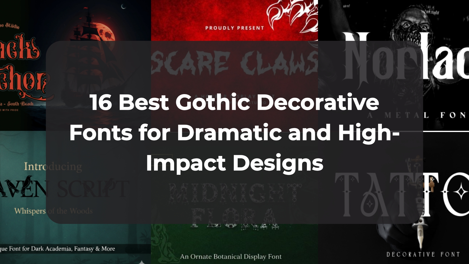
16 Best Gothic Decorative Fonts for Dramatic and High-Impact Designs
Finding a striking typeface that brings an immediate dark elegance, aggressive edge, or historic grandeur to your project can be a massive creative challenge. That is exactly why I have spent days curation-testing these aggressive and ornate assets. In this post, I am sharing 16 of my absolute favorite choices to help you find the ultimate gothic decorative font that will inject a powerful, commanding, and deeply authentic signature energy straight into your next big print or digital layout.
1. Big Goosebumps Gothic Decorative Font


Every now and then, a project comes along that demands you step completely outside the realm of delicate script lines and embrace something beautifully eerie, heavy, and full of vintage character. That is precisely why this bold asset caught my attention and earned a top spot on my current design recommendation list. The primary advantage of this striking gothic decorative font lies in its incredibly distinct, wavy letterforms and bold, liquid-like silhouettes that instantly command visual attention. It expertly steps away from traditional, rigid medieval structures to deliver a highly creative modern twist, making it an absolute powerhouse for layouts that require an immediate dark fantasy vibe or a punchy, retro horror aesthetic without losing crisp edge scaling.
My Recommendation: Deploy this unique typeface for seasonal Halloween marketing campaigns, eerie movie poster titles, or bold graphic merchandise prints. To truly unlock its haunting visual potential, try setting your primary headings in a bright lime green or pale white gradient directly against a deep, layered forest green or matte black abstract wave canvas. Pairing these thick, expressive gothic glyphs with a highly clean, low-contrast geometric sans-serif block beneath for your secondary text builds a magnificent structural contrast that keeps your total dark-themed print layout looking perfectly curated, expensive, and intensely professional.
2. Althero Regular Gothic Decorative Font


When my design briefs call for something with an undeniably powerful presence and deep-rooted historical elegance, I immediately look for typefaces that can transport the viewer. That is exactly why I recommend exploring this incredible asset; it perfectly captures the aesthetic of medieval legends and ancient manuscripts. The primary advantage of this regal gothic decorative font lies in its tall, commanding structure paired with impeccably sharp serifs and intricate ornamental details. It masterfully steps away from common, overused historical styles to deliver a genuine sense of chivalry and heroic grandeur, making it an absolute powerhouse for projects that need to honor timeless storytelling with a sophisticated, yet imposing visual signature.
My Recommendation: Deploy this formidable serif for epic fantasy book covers, high-end branding within the gaming or craft beverage industries, or dramatic themed editorial layouts. To fully maximize its visual impact on the page, try setting your primary headlines in gold or aged parchment tones against a deep, rich crimson or matte black background. Pairing these tall, ornate gothic glyphs with a very clean, minimalist linear sans-serif block beneath for secondary details builds a magnificent visual contrast that leaves your final layout looking impeccably curated, expensive, and professional.
3. Loin Gothic Decorative Font


If you are trying to find an asset that adds an immediate, unmistakable texture and a heavy, industrial gravity to your layout, breaking away from standard flat typography is absolutely essential. That is precisely why I suggest adding this incredible typeface to your creative arsenal this season. The core advantage of this bold gothic decorative font lies in its intricate geometric line fillings and highly detailed, dimensional engraved shadowing. It masterfully rejects simple, flat vector treatments to deliver an awesome blackletter-inspired visual impact, making it an excellent choice for headers that require an authentic dark editorial flavor, streetwear branding accents, or historical gaming banners without sacrificing clean edge rendering.
My Recommendation: Deploy this richly textured font for heavy metal band logos, medieval-themed event posters, or bold lifestyle apparel designs. To fully capitalize on its engraved linework and complex inner details, try setting your text in crisp silver or stark white directly against a dark, highly textured animal hide background or moody stone canvas. Pairing these thick, ornate gothic letterforms with a highly structured, minimalist geometric sans-serif block beneath for your supporting data builds an exceptional visual hierarchy that leaves your final layout looking beautifully curated, expensive, and professional.
4. Goblin House Gothic Decorative Font


Every single time I take on a fantasy layout that needs to feel completely captivating yet high-energy and approachable, I love looking for typefaces that subvert typical expectations. That is precisely why this option grabbed my creative focus and earned an absolute premium spot on my active recommendation list. The primary advantage of this playful gothic decorative font lies in its ultra-thick, blocky structures paired with jagged, hand-carved stone outlines that offer a fantastic cartoon quality. It expertly strips away the cold, unyielding historical stiffness of traditional blackletter scripts to inject a massive dose of whimsical energy into your text layouts, making it an incredible choice for main headings that require immediate shelf visibility without losing sharp edge readability.
My Recommendation: Deploy this animated gothic typeface for spooky mobile game titles, cartoon logotypes, or creative streetwear t-shirt graphics. To fully capitalize on its bold silhouettes and jagged outer strokes, try setting your text in a bright neon yellow or toxic green with a heavy dark stroke, positioning it over a moody, deep blue gradient background featuring abstract lens flares. Pairing these thick, expressive characters with an ultra-clean, minimalist sans-serif font block below for your supporting descriptions builds a magnificent visual contrast that leaves your final project looking beautifully curated, expensive, and professional.
5. Spooky Fun Gothic Decorative Font


Whenever a holiday marketing campaign or a playful creative brief lands on my desk, I love finding assets that inject a pure sense of lighthearted energy directly into the visual layout. That is exactly why this vibrant typography option caught my eye and earned an immediate recommendation on my blog today. The core advantage of this eye-catching gothic decorative font lies in its bold, unforced all-caps structure and its delightfully animated cartoon quality. It completely strips away the cold, hyper-formal stiffness of traditional historical blackletter styles to bring an intensely creative and striking aesthetic to your display titles, ensuring that your main headers stand out with exceptional clarity and a punchy visual rhythm.
My Recommendation: Deploy this animated script for seasonal Halloween movie titles, playful mobile game names, or custom graphic merchandise lines. To fully leverage its thick, fluid silhouettes and bold geometry, try setting your main text block in an intense fire-red or warm orange with a bright yellow inline border over a clean, dark matte black background with subtle diagonal textures. Pairing these high-visibility, expressive characters with an ultra-clean, minimalist sans-serif text block below for your secondary details builds a magnificent visual contrast that leaves your final layout looking beautifully curated, expensive, and professional.
6. The Ruster Gothic Decorative Font


Every now and then, I find a typeface that beautifully bridges the gap between old-world weight and contemporary minimalism. That is exactly why this asset earned a premium spot on my blog. The standout advantage of this gothic decorative font lies in its tall vertical architecture and subtle inline accent cuts. It effortlessly brings an iconic, serious, and dark feel to your text, giving headings a powerful posture without cluttering the page.
My Recommendation: Deploy this sharp font for luxury streetwear branding, moody editorial titles, or dark book covers. To let its bold geometry speak clearly, set the letters in deep black over a minimalist white workspace backdrop. Pairing these gothic forms with a tiny, clean linear sans subhead below creates a brilliant visual contrast that leaves your final layout looking curated, expensive, and professional.
7. Firya Gothic Decorative Font


When you need to break through the noise of predictable assets and inject an explosive, raw attitude into a layout, choosing a script with an aggressive edge is a total game-changer. That is why I highly recommend this asset. The core advantage of this vibrant gothic decorative font lies in its heavy, high-contrast block forms and sharply jagged outlines. It masterfully strips away the historical stiffness of traditional blackletter to deliver a fresh street-culture aesthetic that guarantees high-impact display quality.
My Recommendation: Deploy this striking typeface for action movie titles, game logos, or creative streetwear graphics. To unleash its power, set the text in stark white over a vibrant, paint-splattered orange backdrop. Pairing these thick gothic shapes with a clean, low-contrast sans text block below builds a magnificent visual balance that leaves your final layout looking beautifully curated and professional.
8. Arrowman Gothic Decorative Font


If you want to construct a visual hierarchy that feels instantly piercing, imposing, and anchored in dark fantasy, finding a typeface with sharp, aggressive geometry is everything. That is precisely why this bold asset stands out so clearly to me and has earned a spot in my creative toolkit. The primary advantage of this commanding gothic decorative font lies in its ultra-tall vertical proportions and the signature arrow-like diamond points that trim the top and bottom edges of each character. It completely shakes off the dense, unreadable clutter of traditional blackletter scripts to deliver a beautifully modern, clean-cut sharpness that turns your main presentation headlines into absolute eye-catchers.
My Recommendation: Deploy this strong, sharp typeface for dark nature photography branding, epic video game logos, or atmospheric metal band covers. To unlock its full mysterious potential, try styling your text with a glowing outer aura or an inner gradient fill, positioning it directly against a misty, moody dark forest canvas or a stormy mountain backdrop. Pairing these tall, aggressive gothic letters with a completely minimal, low-contrast sans-serif font block below for secondary data creates a magnificent visual contrast that leaves your final layout looking curated, expensive, and professional.
9. Scare Claws Gothic Decorative Font


Every single time I take on a gritty editorial project or a dark brand identity, I find myself looking for heavy letterforms that completely shatter the rules of polite typography. That is precisely why this terrifying asset secured a prime spot on my personal recommendation list. The primary advantage of this thrilling gothic decorative font lies in its fiercely jagged, bone-splintered strokes and aggressively carved inner contours. It expertly avoids the clinical perfection of basic vector shapes to deliver a raw, creature-inspired posture, making it an absolute powerhouse for main display titles that need to evoke an immediate sense of danger, dark fantasy, or classic cinematic horror without losing excellent scaling crispness.
My Recommendation: Deploy this monstrously expressive typeface for heavy metal music badges, horror book covers, or custom Halloween graphic tees. To unlock its full cinematic potential, try setting your text lines in a stark, contrasting white or pale neon green directly against a highly textured, blood-red velvet background graphic. Pairing these heavily distorted, sharp gothic forms with a quiet, widely spaced geometric all-caps sans text block underneath for secondary labels builds a magnificent visual contrast that leaves your final layout looking beautifully curated, expensive, and professional.
10. Xpart Gothic Decorative Font


If you are searching for a typographic asset that brilliantly bridges the gap between classic dark aesthetics and sleek, futuristic sci-fi design, finding something with a liquid, distorted outline is absolutely everything. That is exactly why this stunning typeface has caught my creative attention and earned a top recommendation on my personal blog today. The core advantage of this exquisite gothic decorative font lies in its melting, biomechanical letter contours and its smooth, rounded inline details. It effortlessly sheds the traditional, dusty stiffness of historical medieval blackletter to offer a beautifully fresh, tech-infused visual identity that brings a highly sophisticated, dramatic, and captivating posture straight to your main digital headings.
My Recommendation: Deploy this versatile display font for cyberpunk-style movie titles, futuristic video game branding, or striking street-culture graphic apparel lines. To let its unique melting geometry and dual-line outline effect truly command the page hierarchy, try setting your text in a bright neon cyan or electric blue directly over a deep, dark violet or dark gray gradient canvas. Pairing these complex, expressive characters with an ultra-clean, minimalist lowercase sans-serif text block underneath for your secondary project data builds a magnificent visual contrast that leaves your final layout looking expertly curated, expensive, and professional.
11. Sharp Fantasy Gothic Decorative Font


Whenever a brief lands on my desk that calls for deep world-building, magical mysticism, and an undeniable edge, I automatically search for letterforms that feel like they were carved out of ancient stone. That is precisely why this incredible typeface immediately captured my creative eye and earned a top recommendation on my personal blog today. The primary advantage of this striking gothic decorative font lies in its beautifully balanced blend of medieval-inspired structures, jagged razor-sharp strokes, and heavily stylized curves. It completely sheds the flat, sterile feel of typical modern vectors to inject a dramatic presence and a dark, epic narrative straight into your main typography layouts, ensuring your text commands instant attention.
My Recommendation: Deploy this evocative script for high-fantasy gaming titles, dramatic book covers, or atmospheric editorial layouts. To fully maximize its mystic, sharp-edged footprints, try setting your primary headings in a crisp, clean black or an aged silver overlay directly over a moody, deep purple gothic cathedral backdrop with soft candelabra lighting effects. Pairing these aggressive, textured letterforms with a highly structured, ultra-minimalist lowercase linear sans-serif block beneath for your supporting text details builds an exceptional visual harmony that leaves your final canvas looking beautifully curated, expensive, and professional.
12. Heritangle Gothic Decorative Font


If you want to inject a profound sense of dark academia, historic grandeur, and pure theatrical drama straight into your active editorial workspace, working with highly ornamental letterforms is an absolute must. That is precisely why this Victorian-inspired masterpiece instantly captured my creative eye and earned a top spot on my blog today. The core advantage of this breathtaking gothic decorative font lies in its heavy, architectural structure beautifully adorned with intertwining botanical tendrils, razor-sharp serifs, and elaborate swirling flourishes. It masterfully steps away from flat, modern minimalism to deliver an incredibly dense, standalone work of art that gives your primary textual headers an immediate posture of absolute authority, mystery, and high-fashion luxury.
My Recommendation: Deploy this visually rich display typeface for singular monogram branding, dark fantasy book covers, or cinematic poster layouts. To fully accentuate its intricate ornamental details and high-contrast beauty, try setting your text lines in an elegant gold or antique silver hue directly against a solid, matte black silk canvas or a deep emerald background. Pairing these incredibly dense and expressive gothic letterforms with a very quiet, minimalist serif font block below for your secondary descriptions builds an exceptional visual harmony that keeps your final project looking beautifully curated, expensive, and professional.
13. Skullz Gothic Decorative Font


Every now and then, a project demands that you throw out the standard rulebook entirely and introduce an asset that is unashamedly bold, eerie, and visually shocking. That is precisely why I knew I had to feature this macabre masterpiece on my blog today. The primary advantage of this thrilling gothic decorative font lies in its incredibly detailed, hand-drawn architecture, where every single letterform is intricately built out of clustered skull illustrations and organic bonework textures. It completely strips away the clean, corporate lines of typical display vectors to give your text layouts an instant injection of haunting energy, delivering a raw, tactile finish that guarantees massive impact and unparalleled scannability across any seasonal display.
My Recommendation: Deploy this heavily textured display font for rock or heavy metal album covers, spooky Halloween festival banners, or custom graphic merchandise lines. To make these skull-carved glyphs truly pop off the canvas without looking muddy, try setting your headers in a sharp black-and-white high-contrast fill over an atmospheric, dark gray misty night background under a pale full moon. Pairing these highly complex, expressive gothic characters with an ultra-clean, minimalist geometric sans-serif block underneath for your supporting details builds an exceptional visual balance that leaves your total print layout looking beautifully curated, expensive, and professional.
14. Tattoo Gothic Decorative Font


If you want to construct a visual hierarchy that feels sharp, edgy, and heavily rooted in traditional ink culture, finding a typeface with clean geometry and custom internal ornaments is a total game-changer. That is exactly why this striking option captured my eye and earned an immediate recommendation on my design blog today. The key advantage of this bold gothic decorative font lies in its ultra-crisp display contours seamlessly blended with dramatic, flared serifs and beautiful diamond-shaped negative space accents embedded within each letterform. It effortlessly avoids the muddy, unreadable clutter of traditional blackletter scripts to deliver an exceptionally high-impact, modern posture that gives your main presentation headlines an immediate attitude and unforgettable style.
My Recommendation: Deploy this edgy display script for alternative streetwear branding, rock band posters, or a modern tattoo studio identity. To let its sharp, diamond-accented geometry truly command the layout, try setting your text in a stark, solid white directly against a deep matte black background featuring a low-contrast image of a tattoo machine. Pairing these thick, expressive gothic characters with an ultra-clean, compressed linear sans-serif block underneath for secondary data creates a magnificent structural balance that leaves your final layout looking beautifully curated, expensive, and professional.
15. Raven Script Gothic Decorative Font


Every single time I map out a project rooted in dark academia, mystical narratives, or avant-garde fashion, I search for letterforms that can instantly build an atmosphere of dense mystery. That is precisely why this breathtaking option has landed right at the front of my active studio inspiration boards. The standout advantage of this artistic gothic decorative font lies in its ultra-sharp terminals and the beautifully dramatic, sweeping flourishes woven directly into the alphabet. It effortlessly avoids the flat, predictable geometry of typical cursive options to offer a signature handcrafted look, allowing you to transform basic headers into intricate, sophisticated masterpieces that command attention across any digital or print layout.
My Recommendation: Use this highly dramatic display typeface for high-impact branding titles, dark fantasy book covers, or luxury lifestyle packaging labels. To let its sharp contours and custom bird-inspired silhouettes truly captivate your audience, try setting your primary headings in a solid raven-black or aged pewter hue over an atmospheric, deep misty green forest backdrop. Pairing these expressive, ornamental gothic letterforms with a very clean, low-contrast linear serif text block directly underneath for secondary details builds a magnificent visual contrast that leaves your final layout looking exceptionally curated, expensive, and professional.
16. Norlack Gothic Decorative Font


Finding an asset that injects an unfiltered, high-octane energy and heavy metal defiance directly into a blank layout can be a massive creative challenge. That is precisely why I am thrilled to feature this aggressive blackletter typeface on my design blog today. The standout advantage of this bold gothic decorative font lies in its immensely thick vertical stems balanced by viciously sharp thorns and jagged decorative notches branching off the letterforms. It masterfully discards the dusty, hard-to-read layout clutter of old historical scripts to deliver a beautifully crisp, stage-ready layout posture, making it an absolute powerhouse for main presentation headers that require maximum shelf presence and an immediate, commanding medieval edge.
My Recommendation: Deploy this heavy metal display script for intense concert posters, alternative tattoo branding, or bold graphic streetwear merchandise lines. To fully unleash its dark medieval spirit and aggressive contours, try setting your text lines in a stark, solid white color positioned directly over a high-contrast, moody black-and-white concert performance backdrop. Pairing these thick, expressive gothic shapes with a widely tracked, clean linear serif font block beneath for your supporting details builds an exceptional structural balance that leaves your total print design looking beautifully curated, expensive, and professional.
Conclusion
Choosing the right display typography is all about giving your modern alternative, fantasy, or horror-themed concepts a distinct visual weight that instantly captures an audience’s attention. I truly hope this handpicked collection guides you straight to the perfect gothic decorative font to beautifully anchor, empower, and transform your next gaming title, streetwear brand, or dark editorial project. Drop a comment below to let me know which of these 16 options stole your heart, and let’s keep creating together!
You may also like
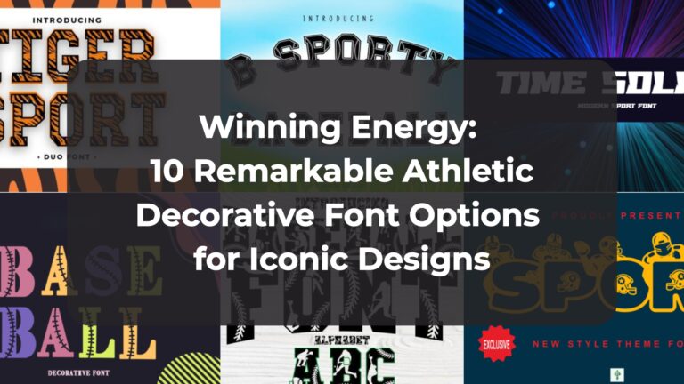
- Winning Energy: 10 Remarkable Athletic Decorative Font Options for Iconic Designs
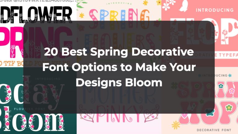
- 20 Best Spring Decorative Font Options to Make Your Designs Bloom
- The Botanical Edit: Top 14 Floral Decorative Font Picks from a Designer’s Workspace
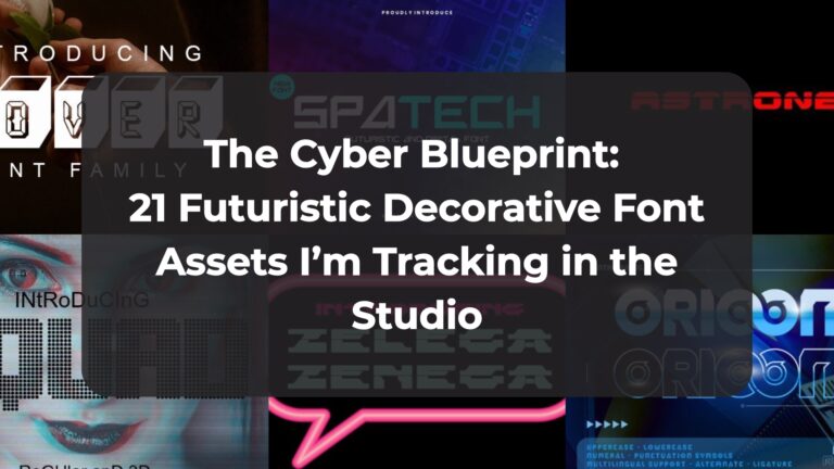
- The Cyber Blueprint: 21 Futuristic Decorative Font Assets I’m Tracking in the Studio