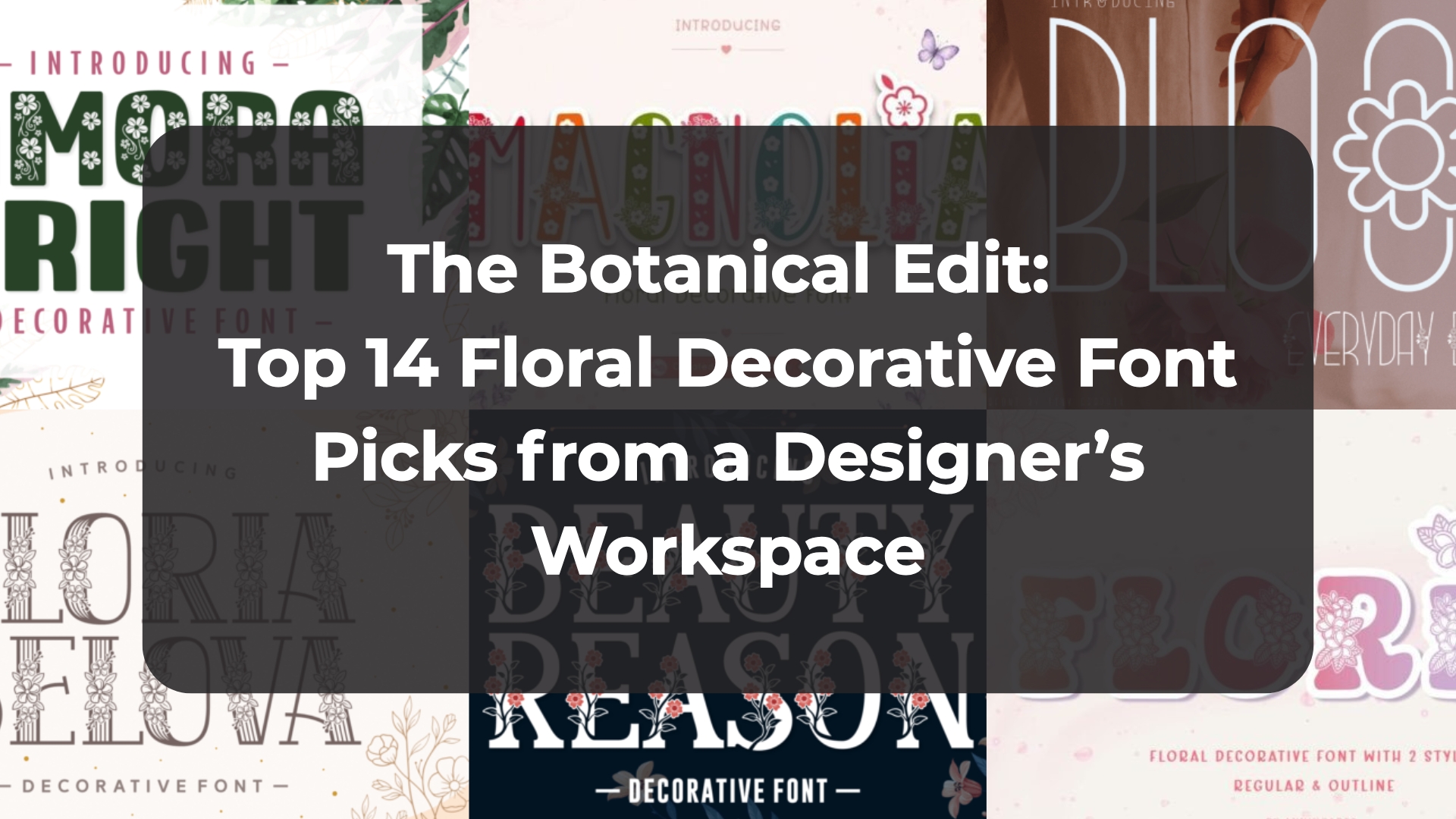
The Botanical Edit: Top 14 Floral Decorative Font Picks from a Designer’s Workspace
Watching an artboard come alive when you trade rigid geometry for organic beauty is one of my favorite studio shifts. When a client brief demands an elegant, deeply sentimental touch, finding the perfect Floral Decorative Font is an absolute game-changer. I’ve handpicked 14 of my top typography assets that seamlessly blend delicate botanical details with clean, professional layout grids.
1. Magnolia Floral Decorative Font


When a client brief calls for an elegant, deeply sentimental touch, trading hard geometric lines for organic botanical details is a complete game-changer. Magnolia steps onto the canvas as an incredibly graceful Floral Decorative Font inspired by delicate spring blossoms and soft, high-end layouts. Every individual letter is thoughtfully interwoven with intricate, tiny flowers, creating a charming, romantic silhouette that brings a quiet, artisanal sophistication straight to your primary typography.
In my own day-to-day studio workflow, I find this typeface behaves like an absolute dream for seasonal stationery and print-on-demand merchandise. It strikes a beautiful balance between playful charm and pure elegance, making it a stellar anchor for elegant wedding invitations, Mother’s Day design projects, and heartfelt greeting cards. Because the botanical embellishments are integrated cleanly into the character paths, it scales beautifully for physical assets like printed tote bags and t-shirts, ensuring your layout holds a crisp visual hierarchy while feeling entirely gentle and bespoke.
2. Beauty Reason Floral Decorative Font


There is a subtle art to adding ornamentation to a blank artboard without completely suffocating the underlying layout structure. That is exactly why Beauty Reason caught my eye; it serves as a remarkably charming Floral Decorative Font that brings a clean, botanical elegance directly to your primary titles. Instead of forcing you to rely on heavy, distracting clip art, this lovely typeface integrates its organic details smoothly into the character paths, allowing you to embellish your typography while keeping a highly sophisticated editorial canvas.
In my everyday design routine, I’ve found this face functions as a phenomenal choice for romantic stationery suites and high-end seasonal branding materials. It is absolutely tailor-made for spring-themed editorial projects, delicate Mother’s Day collateral, and bespoke wedding invitations that demand an unmistakably beautiful floral touch. The underlying line weights remain balanced even with the botanical flourishes, ensuring your visual hierarchy stays rock-solid whether you are mapping out a digital hero banner or prepping a luxury packaging template for print.
3. Bloom Floral Decorative Font


It is incredibly refreshing when an ornamental typeface manages to look completely organic without cluttering up your digital workspace. Bloom is a brilliant example of modern minimalism meeting natural elegance, stepping onto the canvas as a highly versatile Floral Decorative Font. It utilizes thin, graceful strokes and sophisticated curves to bring a fresh, nature-inspired presence directly to your artboard, effortlessly avoiding the heavy, over-embellished lines that usually slow down a clean design.
In my own day-to-day studio routine, I treat this typeface as a multi-seasonal asset for any creative brief that requires a soft yet striking personality. It functions beautifully as a clean typographical anchor for high-end logos, editorial packaging templates, scrapbooking assets, and minimalist greeting cards. Because the delicate floral details are integrated flawlessly into the underlying geometry, it guarantees a rock-solid visual hierarchy, giving you an elite layout tool that makes your design assets flourish across both digital screens and physical print.
4. Florin Floral Decorative Font


Balancing high-end layout principles with a youthful, high-energy client brief can be a tricky tightrope walk when you are staring at a blank canvas. That is exactly where Florin comes into play, delivering a completely fresh and lighthearted take on the traditional Floral Decorative Font. What makes this typography asset an absolute blast to work with is its dual-style architecture—offering both a clean regular weight and a striking outline option packed with embedded flower illustrations that allow you to experiment with custom gradient fills and vibrant vector overlays effortlessly.
In my daily studio routine, I’m always hunting for ornamental typefaces that can handle heavy color scaling without ruining the underlying grid alignment. Florin functions like an absolute charm for high-impact seasonal greeting cards, children’s educational projects, and expressive digital headers where your titles need to instantly command attention. Because you can layer the outline paths directly over the solid characters, it gives you incredible creative freedom to build multi-dimensional layouts while maintaining a perfectly crisp visual hierarchy across both physical merch templates and mobile screens.
5. Gloria Belova Floral Decorative Font


Finding a display typeface that successfully blends delicate botanical ornamentation with a commanding structural weight is a rare victory when building out a high-end layout. Gloria Belova hits the canvas with an incredible sense of feminine beauty and grace, serving as an exceptional Floral Decorative Font that doesn’t shy away from being bold. Intricate leaves and delicate flowers drape elegantly over classic serifs and fluid flourishes, resulting in a whimsical, romantic silhouette that maintains a remarkably strong visual presence.
In my own design workflow, I’ve found that this unique combination of heavy letterforms and soft botanical accents makes it a stellar anchor for high-impact print collateral. It functions beautifully for luxury wedding invitations, sophisticated greeting cards, and bespoke packaging assets that require a touch of elite floral charm without sacrificing readability. The integrated flourishes provide just enough decorative sophistication to let your primary headers command the space while keeping your overall grid clean, balanced, and impeccably polished.
6. Amora Bright Floral Decorative Font


When a layout requires massive visual weight but you still want to retain a soft, organic soul, striking the right balance can be a bit of a puzzle. That is exactly where Amora Bright shines, stepping onto the artboard as a strikingly beautiful Floral Decorative Font. It pairs thick, robust characters with incredibly delicate flower decorations woven neatly over the paths, giving your headline text an immediate graphical presence while maintaining a warm, hand-crafted delicacy.
In my everyday studio workflow, I love using this typeface for high-impact commercial branding and print layouts where whisper-thin lines would simply get lost. It serves as an absolute go-to for florist advertising materials, spring-themed digital campaigns, custom gift packaging, and seasonal greeting cards. The heavy letterforms ensure that even when printed or viewed on smaller screens, your typography retains its clarity and commands a solid visual hierarchy, letting you inject a gorgeous botanical theme onto your active canvas while keeping your message bold and readable.
7. Daisy Love Floral Decorative Font


Pivoting away from ultra-serious, traditional botanical serifs to inject pure, lighthearted energy into an artboard is one of my favorite creative detours. That is exactly where Daisy Love comes into play, operating as a wonderfully cute and adorable Floral Decorative Font. It strips away any stiff, corporate formality, trading complex or heavy flourishes for rounded, joyful character shapes that instantly brighten up a blank canvas with a soft, cheerful charm.
In my own everyday design routine, this typeface is a phenomenal asset when a client project demands a youthful, highly approachable presence without losing graphical clarity. It functions like an absolute charm for playful children’s games, whimsical book covers, vibrant cartoon-related assets, and bold event posters. Because the friendly letterforms hold up so beautifully at display sizes, it anchors your layout’s visual hierarchy perfectly, giving you a versatile tool to build distinct brand names and engaging quotes that radiate pure positivity.
8. Boga Floral Decorative Font


Sometimes you don’t need a deeply intricate or over-embellished typeface to bring a raw, organic energy onto the screen. That is exactly where Boga steps onto the artboard, offering an incredibly clean and expressive approach to the classic Floral Decorative Font style. It masterfully infuses your typography with an effortless touch of nature, seamlessly transforming rigid digital vector paths into organic visual elements that immediately draw the eye without disrupting your layout’s overall flow.
In my day-to-day creative routine, I’ve found this face to be a remarkably versatile asset for clean branding setups and high-impact print media. It acts as a phenomenal typographical anchor for organic logo marks, large-scale event posters, and bold editorial headers where you need an instant graphic punch. The well-balanced character geometry keeps the visual hierarchy perfectly intact across your canvas, giving you a beautiful, nature-inspired option that keeps your primary layouts both incredibly readable and strikingly unique.
9. Made Florn Floral Decorative Font


Walking into a new spring branding project with a highly adaptable typography toolkit makes all the difference when you’re staring at a blank canvas. Made Florn stands out as a stunningly elegant Floral Decorative Font that brings an effortless, graceful botanical charm directly into your workspace. What makes this particular asset such an absolute joy to deploy is its smart, dual-version architecture—giving you both a delicate regular cut and a bold solid weight laced with floral features, allowing you to seamlessly experiment with layering and contrast within your composition.
In my own design routine, I’ve found that having those two distinct styles is a total game-changer for maintaining a crisp visual hierarchy. The regular style functions beautifully for high-end editorial logos, delicate greeting cards, and inspirational typography quotes, while the solid cut holds down the weight needed for tactile fabric prints, seasonal decorations, and intricate DIY crafts. It perfectly bridges the gap between clean digital paths and physical print-on-demand products, ensuring your layout remains beautifully balanced, readable, and undeniably sophisticated.
10. Floral Decorative Font


There is an undeniable magic that happens when you allow raw, botanical elements to completely dictate the architecture of your letterforms. If you are looking to ground your current artboard in an organic, whimsical style, this self-titled masterclass steps onto the canvas as an exceptional Floral Decorative Font. It completely ditches predictable geometric lines in favor of unique, leafy characters that feel effortlessly alive, bringing a vibrant, nature-inspired personality straight to your primary header lines.
In my everyday design routine, I’ve found this typeface to be a stellar choice for fast-paced, creative projects where you need an instant shot of organic character without sacrificing legibility. It handles beautifully across large-scale posters, custom greeting cards, and high-energy social media graphics where standard, flat text blocks would simply fail to capture attention. Because the leafy accents are integrated cleanly into the underlying paths, it anchors your lifestyle branding configurations and event invitations flawlessly, ensuring your visual hierarchy remains rock-solid, balanced, and completely captivating.
11. Floria Floral Decorative Font


There is something incredibly powerful about dropping an all-caps display face onto an artboard when you want to make an absolute statement. Floria steps onto the canvas as a stunning Floral Decorative Font that masterfully blends high-end elegance with pure creative flair. Each uppercase character is meticulously adorned with intricate flower illustrations built right into the letterforms, instantly turning simple headline tracks into beautifully detailed, standalone pieces of vector art.
In my own studio workflow, I’ve found this typeface to be a total goldmine for branding briefs that demand a romantic, explicitly feminine touch. It functions flawlessly for bespoke monograms, editorial logos, and elegant wedding invitations, yet it possesses enough structural clarity to scale beautifully onto physical merchandise like seasonal tote bags, custom t-shirts, and home decor prints. Because the botanical work is so clean and deliberate, it keeps your layout’s visual hierarchy perfectly balanced while infusing the entire composition with a fresh, premium botanical charm.
12. Dream Garden Floral Decorative Font


Sometimes a layout doesn’t need massive, over-the-top botanical graphics to feel alive; instead, it just needs a quiet, imaginative touch embedded right into the lettering itself. Dream Garden blooms onto the artboard doing exactly that, serving as a beautiful Floral Decorative Font that relies on delicate, cute little ornaments woven along the stems. It swaps out sterile, harsh geometric lines for subtle nature-themed accents, making it an ideal choice for any layout where you want to introduce a lovely organic touch without overcrowding your canvas.
In my own day-to-day studio routine, I find this typeface behaves like an absolute charm for eco-conscious branding campaigns, nature-themed design projects, and custom lifestyle merchandise. The pint-sized ornaments are cleanly integrated into the vector paths, which means the font scales down smoothly for subtle product packaging labels or blows up beautifully to anchor large-scale poster headings and greeting cards. It keeps your primary composition clean and your visual hierarchy perfectly intact, giving you a highly functional typography asset that brings a fresh, nature-inspired personality straight to your active project.
13. Kosalia Floral Decorative Font


Stumbling across a typeface that manages to pack immense detail into whisper-thin vector paths is always a massive win for my design library. Kosalia makes a stunning entry onto the artboard as a highly detailed Floral Decorative Font built around slim, elegant lines and expressive, curvy swashes. It completely discards heavy, chunky structures in favor of an intricate, graceful flow that gives your primary typography an incredibly elevated, custom-tailored feel.
In my everyday studio workflow, I treat a delicate display face like this as an absolute secret weapon for high-end branding briefs and editorial layouts. Because it is beautifully embellished with flowing botanical swashes, it has the unique potential to enhance almost any creative composition—from elegant wedding stationery and cosmetics branding to minimalist digital hero sections. The refined line weights guarantee that your layout maintains a highly sophisticated visual hierarchy, allowing your titles to stand out elegantly while keeping the overall canvas clean and beautifully balanced.
14. Peony Floral Decorative Font


When a layout demands an intimate, soft-spoken touch without feeling overly complicated, embedding subtle botanical accents right into the letterforms is a brilliant strategy. Peony arrives on the artboard as a wonderfully charming Floral Decorative Font that strikes a clean balance between organic detail and crisp structure. It completely swaps out clinical, sterile lines for delicate floral elements, instantly transforming your headline text into inviting, hand-crafted focal points that feel beautifully personal.
In my day-to-day studio routine, I’ve found that this typeface operates as a true multi-purpose asset across both digital and physical mediums. It feels right at home in a relaxed layout for taking digital notes, writing lifestyle diaries, or designing custom greeting cards, yet it carries enough structural clarity to handle bold commercial products. Whether you are mapping out web banners, social media posts, and stationery sets, or prepping production files for physical merchandise like custom mugs and printed shirts, Peony keeps your visual hierarchy perfectly balanced and easy to read.
Conclusion
Ultimately, deploying a Floral Decorative Font successfully comes down to balancing elegant ornamentation with a clean visual hierarchy. Whether your current project requires an elegant wedding serif, a playful kids’ asset, or a minimalist outline weight, these 14 curated typography picks offer incredible creative freedom. Drop them onto your artboard and let your primary titles bloom.