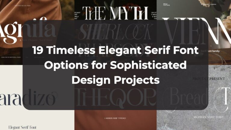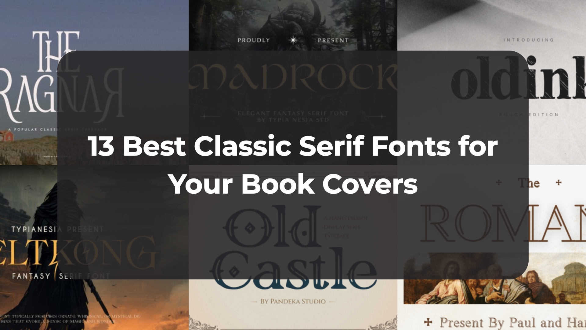
13 Best Classic Serif Fonts for Your Book Covers
Typography is the secret language of a brand, and nothing speaks louder than a well-chosen Classic Serif Font. As I curate new assets for my creative toolkit, I look for letters that offer both warmth and professional authority. This list of 13 typefaces showcases the best in heritage-driven design, ensuring your next project feels established, polished, and ready to make a lasting impression.
1. Old Castle Classic Serif Font


Walking through the history of traditional printing always makes me appreciate the romance of antique literature, and Old Castle is a Classic Serif Font that captures that vintage spirit perfectly. It acts as a refined nod to timeless typography, featuring ornamental charm and balanced letterforms that evoke a sense of historical grandeur. For anyone aiming to infuse a layout with sophistication and authenticity, this typeface provides the perfect bridge between the past and the present.
Finding a heritage-driven aesthetic that feels genuinely authentic is a rare win for a digital content creator, but this Classic Serif Font delivers that sense of grandeur without effort. It is particularly effective for book covers, editorial layouts, and museum-style campaigns where a distinguished presence is required to anchor the visual storytelling. This is the kind of resource that ensures a creative project—whether for a personal blog or a premium brand—feels both professional and deeply rooted in classic beauty.
2. Madrock Classic Serif Font


Sometimes a design needs to transport the audience to another world entirely, and Madrock is a Classic Serif Font that manages to do exactly that through its enchanting details. It beautifully blends a traditional structure with a mystical storytelling vibe, featuring delicately crafted curves that feel both magical and grounded. Whenever I am looking for a typeface that brings a sense of otherworldly charm to a page, this one stands out for its unique ability to balance high-end elegance with a distinctively fantasy twist.
What makes this Classic Serif Font such a valuable addition to a modern toolkit is its incredible versatility across thematic projects. It shines exceptionally well on fantasy-themed posters and book covers, but it is also a sophisticated choice for beauty or fashion branding where a touch of grace is required. Whether I am working on social media graphics or high-end packaging, Madrock ensures the visual narrative feels cohesive, graceful, and just a bit enchanted, making it a go-to for any project that needs a storytelling edge.
3. The Ragnar Classic Serif Font


There is a certain level of authority that comes with using a well-crafted Classic Serif Font, and The Ragnar perfectly embodies that sense of timeless elegance. As a digital content creator, I find myself reaching for this typeface when a project demands balanced proportions and well-defined serifs that command respect without being overbearing. It’s a fantastic asset for creating vintage-inspired logos or formal certificates, as it naturally infuses the design with a sophisticated, established feel that resonates with a sense of history.
From a professional design perspective, the versatility of this Classic Serif Font makes it an essential part of a creator’s toolkit, especially for high-stakes visual storytelling. Whether I’m working on luxury packaging, editorial layouts, or even dramatic movie posters, its refined look adds a layer of prestige that is hard to replicate. It’s the perfect choice for anyone who needs to bridge the gap between traditional aesthetics and modern professionalism, ensuring that every composition feels both polished and deeply rooted in tradition.
4. Beltkong Classic Serif Font


Finding a typeface that successfully bridges the gap between traditional structure and mythical allure is always a thrill, and Beltkong is a Classic Serif Font that does exactly that with its bold, striking characters. As a digital creator often looking for assets that stand out on visual platforms like Behance, I appreciate how this font brings a sense of mystique and grandeur to any headline. It is more than just a set of letters; it is an imaginative tool that merges the timeless qualities of a serif with a unique fantasy vibe, making it perfect for those projects that need a bit of storytelling magic.
What makes this Classic Serif Font a truly versatile choice for a designer’s toolkit is the inclusion of unique alternates and extensive multilingual support, allowing for a bespoke look across global applications. I can easily see this being the centerpiece for a fantasy-themed game, a cinematic movie title, or even high-end music branding where you want to evoke a specific charm. The intricate detailing ensures it stands out in a crowded digital landscape, offering a balance between classic style and creative fantasy that I find incredibly useful for driving visual engagement on design-heavy resources.
5. Oldink Classic Serif Font


There is something undeniably nostalgic about the look of traditional letterpress, and Oldink is a Classic Serif Font that captures that “worn ink” aesthetic with incredible accuracy. As a digital content creator who spends a lot of time reviewing and selecting typography for professional design articles, I am particularly impressed by how the classic structure is elevated by a rough, textured finish. It gives the letters an authentic feel full of character, bringing a sense of history and craftsmanship to a digital layout while making each word feel tactile and deeply human.
When it comes to projects that need a literary or heritage-driven soul, this Classic Serif Font is a fantastic choice for editorial design, book covers, or even heritage-style branding. I love that the subtle ink distress adds visual texture and depth without ever sacrificing readability, which is a balance I always look for when curating resources for my blog. Whether I am working on a primary headline or a set of quotes, Oldink provides a level of storytelling and nostalgia that makes any creative composition feel grounded, professional, and intentionally aged.
6. The Romans Classic Serif Font


There’s something about architectural grandeur that immediately grounds a design, and The Romans is a Classic Serif Font that brings that majestic, ancient feel directly to your layout. I love the unique double-line structure because it adds a “chiseled” depth to each character, making it feel less like a static font and more like a permanent engraving. As a digital content creator who regularly evaluates typography for professional articles, I find that this typeface commands a unique level of respect, perfectly conveying a sense of enduring legacy and classical wisdom.
What makes this Classic Serif Font so functional is its ability to blend that historical weight with clean, modern legibility. It’s a fantastic choice for professional branding—think law firms or academic journals—but it also shines in more celebratory contexts like wedding designs or luxury packaging. For me, pairing it with classical art or textured paper backgrounds is the secret to making a composition feel like a piece of living history while maintaining the professional polish required for modern design resources.
7. Rustive Classic Serif Font


I’ve always been drawn to typefaces that feel like they have a story to tell, and Rustive is a Classic Serif Font that brings a heavy dose of personality to the table. It takes a traditional serif structure and elevates it with a subtle grunge texture that feels genuinely nostalgic, much like an old-school print press. These distressed edges are perfect for adding a layer of tactile authenticity to a layout, giving it a character that perfectly clean digital fonts often miss.
In my own design work, I’ve found this Classic Serif Font to be a standout choice for anything that needs an extra bit of edge, from retro branding to music posters. It has a bold, rugged presence that helps editorial layouts pop, allowing you to maintain a professional look while embracing a heritage-driven aesthetic. It’s an essential resource for those times when you want a design to feel established, storied, and intentionally unique.
8. Merside Classic Serif Font


Every now and then, I stumble upon a typeface that feels like pure luxury from the very first glance, and Merside is a Classic Serif Font that fits that description perfectly. As I continue to curate high-quality resources for my digital projects, I’m always searching for those clean, crisp lines that suggest a high level of attention to detail. This particular font brings a timeless quality to the screen that elevates any visual composition, making it an incredibly reliable choice for anyone wanting to convey a sense of genuine refinement in their work.
What I find most impressive about this Classic Serif Font is how effortlessly it balances a traditional style with a sleek, modern twist, making it a powerhouse for luxury branding and fashion-forward designs. It is the kind of professional asset that makes a logo or a piece of product packaging feel exclusive and thoughtfully crafted, which is exactly the aesthetic I aim for with my blog, creativekitbox.com. Whether you are working on a premium visual identity for a client or simply want to give your own content a professional edge, Merside provides a polished and sophisticated look that simply never goes out of style.
9. Preta Classic Serif Font


I’ve always found that the most memorable designs are the ones that feel truly “human,” and Preta is a Classic Serif Font that manages to capture that organic warmth perfectly. Its softly sculpted letterforms and natural rhythm create an elegant yet approachable presence that feels both timeless and expressive. As a professional digital content creator, I’ve found that this typeface offers a refined organic tone that sits beautifully between classic tradition and modern sensibility.
What really stands out when managing digital design resources is how a Classic Serif Font like this can be so versatile for editorial layouts and branding. The organic details add character without ever overpowering the readability, making it a fantastic choice for everything from magazines and book covers to premium visual identities. With broad multilingual support and a complete character set, it’s a professional-grade resource that ensures your creative work feels polished and intentional across various digital and print media.
10. Hellen Classic Serif Font


There is a profound sense of history that comes with certain typefaces, and Hellen is a Classic Serif Font that beautifully honors its roots in early 20th-century design. Based on the 1922 Koch Antiqua typeface by German designer Rudolf Koch, it stands out as a delicate option characterized by its notably low x-height. I find that this specific structure makes it an exceptional choice for decorative and display use, where you want the typography to feel light, sophisticated, and intentionally artistic.
One of the things I look for when building a professional toolkit is flexibility, and this Classic Serif Font delivers that with its regular, bold, and oblique styles. Whether I am mapping out an elegant wedding invitation, a striking book cover, or even a unique brand monogram, the refined look of Hellen provides a level of versatility that is hard to beat. It is the perfect resource for headlines and greeting cards alike, ensuring that any project requiring a touch of vintage-inspired elegance feels both cohesive and prestigious.
11. Angelou Classic Serif Font


Whenever I’m looking for a typeface with a bit of a dramatic personality, Angelou is a Classic Serif Font that immediately catches my eye. It brings a bold, expressive energy to the layout, featuring thick, sculpted letterforms and high-contrast lines that radiate vintage charm. I’m particularly fond of its “ink-bleed” inspired terminals—those small, irregular details on characters like the “g” and “e” that give the whole font a tactile, handcrafted quality that feels like it was pulled straight from a traditional printing press.
What really draws me to a typeface like this is how it manages to balance raw strength with a high level of sophistication, which is a rare feat for any Classic Serif Font. It’s an incredible asset for editorial headlines, fashion branding, or impactful posters where you need a voice that is both timeless and contemporary. Whether I’m mapping out a new book cover or a sophisticated logo, these unexpected artistic flourishes ensure the final layout feels prestigious, artistic, and entirely unique.
12. Creators Type Classic Serif Font


There’s something incredibly refreshing about a typeface that feels more like a human hand than a rigid computer script, and Creators Type is a Classic Serif Font that hits that note perfectly. Built for those of us who value personality and depth in our modern layouts, it features softly irregular details and a warm, handcrafted feel that makes a page feel authentic. It balances a timeless serif structure with a thoughtful, expressive character, making it a go-to for lifestyle brands or cultural projects that need to tell a real story.
What makes this Classic Serif Font such a reliable addition to a professional design toolkit is its seamless functionality across both digital and print media. Whether I’m mapping out a new editorial layout or working on branding for a creative publishing project, I appreciate the extensive multilingual support and the solid character set it provides in OTF format. It’s an authentic, high-quality resource that manages to feel both heritage-driven and perfectly suited for the contemporary visual landscape I navigate every day.
13. Wishbone Classic Serif Font


Stepping away from super-smooth modern serifs can be a refreshing change of pace, and Wishbone is a Classic Serif Font that really leans into its medieval inspiration. Its rough and sharp letters give it a bold, complex personality that feels far more authentic and storied than a standard, sterile typeface. Even with these historic roots, the font remains surprisingly simple and easy to read, making it a reliable choice for both striking headers and longer blocks of body text in my digital content projects.
Whether you are working on a historical project, a unique wedding invitation, or even social media posts, this Classic Serif Font adapts to almost any creative scenario I encounter. I’ve found it works beautifully for branding and product packaging where you want to evoke a sense of tradition without losing professional clarity. It is a fantastic addition to a professional design toolkit, offering that rare balance of medieval grit and functional versatility that helps a website or advertisement truly stand out.
Final Thoughts
Ultimately, the right Classic Serif Font acts as a bridge between your creative vision and your audience. I hope these 13 options give you the specific inspiration needed to elevate your work, whether for print or digital media. Don’t be afraid to mix tradition with modern elements—it’s those small, thoughtful choices that truly define a premium and sophisticated brand aesthetic.