The Cyber Blueprint: 21 Futuristic Decorative Font Assets I’m Tracking in the Studio
Staring at a blank artboard when a project calls for a high-tech vibe means it’s time to ditch safe geometry. Lately, my studio workflow has been all about layouts that require a bold Futuristic Decorative Font to stand out. Here is my personal roundup of 21 incredible typography assets that will easily anchor your next next-gen design and elevate your creative workspace.
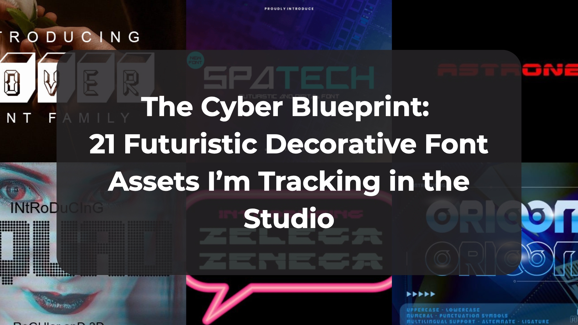
1. Zelega Zenega Futuristic Decorative Font


Stepping into the realm of hyper-modern, industrial tech aesthetics is always an exciting shift when you want to break away from predictable, everyday typography. Zelega Zenega hits the canvas with an undeniably commanding presence, proving that a Futuristic Decorative Font can look incredibly sleek without losing its raw, architectural edge. Characterized by its expansively wide character profiles and a stark, uncompromising structural rhythm, it instantly brings a calculated, sci-fi intelligence to your display copy, making your titles look less like standard lettering and more like premium user interface elements.
In my own day-to-day studio routine, I’ve found this typeface to be an elite asset for cutting-edge digital projects that demand a massive graphic punch. It functions as a phenomenal typographical anchor for tech-inspired layouts, cyberpunk gaming headers, and minimalist branding configurations that need a sharp, forward-looking identity. Because its stark horizontal weights are so beautifully balanced, it holds a rock-solid visual hierarchy across large-scale website hero sections and promotional tech banners, giving you the perfect tool to make your layout feel ahead of its time.
2. Spatech Futuristic Decorative Font


There is a rare thrill in stumbling upon a typeface that instantly shifts the entire energy of an artboard toward the cutting edge. Spatech lands in your workspace as an incredibly unique Futuristic Decorative Font that feels less like a basic digital asset and more like an intentional centerpiece for high-concept graphic design. Masterfully engineered to bridge the gap between speculative tech aesthetics and raw visual impact, its letterforms possess a striking, calculated rhythm that effortlessly pushes even your most conventional concepts right into tomorrow.
Integrating an avant-garde display face into a client-facing toolkit can sometimes be a gamble, but this particular gem functions beautifully when you need to anchor a forward-looking layout. It operates as a phenomenal typographical cornerstone for cyberpunk branding assets, sci-fi editorial headers, next-gen gaming interfaces, and progressive poster layouts. Because its distinct structural contours command attention without suffocating the rest of the canvas, it maintains a flawless visual hierarchy, giving you the exact creative leverage needed to lift your digital assets to their absolute highest potential.
3. Lover Futuristic Decorative Font


Mixing an unexpected, emotional concept with a sleek, high-tech aesthetic is an incredible way to inject genuine friction into a flat layout. Lover does exactly that, arriving on the digital canvas as a highly compelling Futuristic Decorative Font that completely redefines speculative sci-fi type design. It masterfully captures the pulse of advanced cyber culture, trading predictable, machine-cold corners for an expressive, fluid structural architecture that looks less like a basic typeface and more like a conscious piece of digital art.
When prepping production files for physical media or high-impact marketing collateral, you need a display face that translates flawlessly from a glowing monitor to crisp paper. In my own studio workflow, I’ve found this gem looks absolutely stunning across large-scale event posters, club flyers, and avant-garde streetwear prints. It unlocks endless creative possibilities on the artboard, anchoring your layout’s visual hierarchy with a distinct, glowing digital footprint that pairs beautifully with dark-mode backgrounds and vibrant vector gradients.
4. Squad Futuristic Decorative Font


Finding a display face that balances raw, collective energy with a sleek digital edge can instantly spark a stagnant creative session. Squad lands on the canvas as an effortlessly cool Futuristic Decorative Font designed to inject instant inspiration directly into your active workspace. It strips away the overly dense, complex geometry often found in traditional sci-fi lettering, opting instead for clean, confident strokes that make your display copy feel incredibly sharp, unified, and intentional.
In my own everyday design routine, I love using this typeface when a project needs to look modern and high-tech without feeling completely unapproachable. It functions beautifully as a primary typographical anchor for esports branding, streaming overlays, tech-focused editorial spreads, and next-gen product packaging. The well-proportioned character layouts keep your visual hierarchy completely secure, allowing you to build high-impact headers that stand out sharply across both mobile user interfaces and large-scale print banners.
5. Astroneo Futuristic Decorative Font


Leaning into clean geometry is usually my go-to for minimalist layouts, but watching those precise vectors twist into an advanced, sci-fi silhouette is a completely refreshing experience on the artboard. Astroneo lands in your toolkit as a sleek, hyper-modern Futuristic Decorative Font that uses calculated geometric lines to build a remarkably cool visual rhythm. It effortlessly does away with messy, over-complicated vector tracks, offering instead a sharp, streamlined structure that makes your display copy look incredibly polished and deeply intentional.
When it comes to real-world deployment in my own studio workflow, this typeface is a total masterclass in cross-media versatility. It serves as an exceptional typographical anchor for cutting-edge web designs and tech landing pages, yet it retains enough sharp character to elevate print-on-demand merchandise lines, custom streetwear graphics, and even stylized event invitations. The beautifully balanced line weights ensure that your visual hierarchy remains flawlessly stable across both glowing mobile displays and physical screen prints, giving you a reliable asset that brings a refined cosmic edge to any canvas.
6. Orioonic Futuristic Decorative Font


Riding the massive wave of cyber-nostalgia that is currently dominating design feeds is an absolute blast when you want to inject some serious attitude into a layout. Orioonic drops right into this sweet spot, serving as a textbook Futuristic Decorative Font that leans heavily into that fluid, liquid-plastic Y2K tech aesthetic. It perfectly recaptures the raw energy of early internet culture and turn-of-the-century speculative design, trading machine-cold, sterile paths for orbital curves and bold, expressive shapes that make your display titles feel instantly dynamic.
In my own day-to-day creative routine, I’ve found that tapping into this specific retro-futuristic lane is an incredible way to make youth-oriented branding assets instantly pop on screen. Orioonic functions as a brilliant graphical anchor for fast-paced social media graphics, high-impact event posters, and even ultra-modern business cards where you want to leave a lasting, avant-garde impression. The character paths are beautifully executed, ensuring that despite its highly stylized personality, your visual hierarchy remains flawlessly stable across both digital dark-mode grids and physical print layouts.
7. Hornets Futuristic Decorative Font


Staring at a blank canvas when a client asks for “high-tech but with serious muscle” usually sends me hunting for typefaces that don’t apologize for taking up space. Hornets charges onto the artboard doing exactly that, operating as an incredibly bold and commanding Futuristic Decorative Font. It ditches the whisper-thin lines of minimalist sci-fi trends in favor of heavy, aggressive character profiles and high-impact strokes, making your display copy look completely unstoppable and dripping with raw, industrial attitude.
In my own everyday studio workflow, I love keeping a powerhouse face like this on standby for projects that need to pierce through a crowded digital feed or a busy print layout. It functions beautifully as a primary typographical anchor for high-octane sports branding, competitive gaming overlays, streetwear merchandise lines, and action-heavy event posters. Because its bold vectors are meticulously balanced, it locks down your layout’s visual hierarchy with absolute ease, giving you a remarkably versatile asset that fits perfectly into any creative brief demanding a fast, forward-looking edge.
8. Alioth Futuristic Decorative Font


Elevating an editorial layout with a speculative, celestial touch is one of my favorite ways to challenge traditional design rules. Alioth lands on the artboard as a strikingly unique Futuristic Decorative Font that beautifully balances high-tech aesthetics with a refined, artistic grace. Instead of leaning into harsh, aggressive machinery or heavy cyberpunk angles, it opts for a sophisticated and sleek structural architecture that makes your typography look beautifully calculated yet effortlessly fluid, breathing an upscale, next-gen energy into your primary display copy.
In my day-to-day studio routine, I find this typeface to be an incredibly versatile asset when a creative brief straddles the line between premium luxury and forward-thinking tech. It behaves like an absolute dream for high-end magazine covers, sleek corporate business cards, and modern lifestyle branding materials, yet it retains enough subtle warmth to elevate custom greeting cards and inspirational typography quotes. The clean vector geometry and balanced spacing lock down your visual hierarchy seamlessly, ensuring your event posters and digital canvases look entirely custom-tailored and impeccably polished.
9. Astrophel Futuristic Decorative Font


There is a certain kind of satisfaction that comes from working with pure, unyielding line weights where every single vector path is completely uniform. Astrophel steps onto the workspace as a flawless example of this monoline mastery, operating as an incredibly sleek Futuristic Decorative Font that perfectly encapsulates the spirit of our modern tech era. By stripping away complex fills and variable stroke widths, it embraces a crisp, clean structure that feels like a direct manifestation of an avant-garde, technological wave, making it an absolute powerhouse for any layout needing a distinct sci-fi edge.
Incorporating this typeface into my own studio routine has completely streamlined how I approach tech-inspired branding and speculative digital assets. It serves as an integral creative tool for establishing a cutting-edge visual hierarchy on web landing pages, next-gen UI concepts, and modern editorial layouts where clarity is just as vital as style. Because the monoline construction remains perfectly sharp across various scales, it brings a cool, contemporary flair to everything from minimal poster titles to physical tech merchandise, allowing your compositions to project an undeniably crisp, high-tech identity.
10. Skewed Futuristic Decorative Font


Playing with perspective and dynamic angles on a canvas can completely change how a message communicates with a viewer. That is precisely why Skewed feels like such a breath of fresh air on the artboard, functioning as an original and incredibly cool Futuristic Decorative Font. It consciously throws out standard, static vertical grids in favor of intentional slants and sharp, unconventional cuts, bringing an immediate sense of forward motion and high-velocity momentum to your display titles.
In my day-to-day workflow, I find that a face with this much built-in kinetic energy acts as a brilliant typographical anchor for forward-thinking branding projects. It works like an absolute charm for striking vector logos, high-contrast t-shirt printing, and specialized creative products that need to project a distinct futuristic vibe. Because the structural distortion is meticulously calculated across the entire character set, it locks down your layout’s visual hierarchy effortlessly, ensuring your primary copy remains clean and readable while making a bold, unapologetic statement.
11. Maxime Techno Futuristic Decorative Font


There is a distinct pleasure in finding a typeface that seamlessly bridges the massive scale of brutalist architecture with the microscopic detail of a motherboard. Maxime Techno lands on the artboard with that exact high-performance energy, standing out as a definitive powerhouse of a Futuristic Decorative Font. It masterfully fuses a heavy, structural silhouette with intricate, circuitry-inspired outlines and sharp geometric cutouts, instantly giving your display titles an undeniable sense of digital precision and advanced cyberculture.
When I am building visual identities for high-tech environments, this typeface is a phenomenal asset for establishing an immediate atmosphere of innovation. It acts as an incredible typographical anchor for immersive gaming interfaces, cutting-edge software startup logos, and high-energy electronic music posters where standard lettering would completely get drowned out. Because the character forms are so beautifully complex and industrial-chic, it effortlessly holds down a dominant visual hierarchy across science fiction book covers and experimental streetwear lines, giving you a relentless, forward-thinking tool that commands absolute attention on the canvas.
12. Havana Futuristic Decorative Font


Breaking away from the overly aggressive, weaponized angles that often dominate sci-fi type design can be tough when you still want your layout to feel highly advanced. That is exactly where Havana changes the game, offering an effortlessly cool and incredibly unique take on the classic Futuristic Decorative Font style. It discards predictable, machine-cold industrial clichés in favor of a distinctly sleek, sophisticated structural rhythm, giving your primary display lines an undeniable tech-forward edge without feeling hostile or overbearing on the canvas.
In my personal studio workflow, I love keeping a versatile face like this on standby for client briefs that require a refined, high-tech signature rather than a loud, distracting gimmick. It serves as a brilliant typographical anchor for sleek corporate business cards, modern web designs, and digital landing pages where clean spacing and readability are everything. Because its unique contours hold up beautifully at both massive display sizes and smaller print scales, it keeps your layout’s visual hierarchy completely locked in, allowing you to inject a seamless futuristic touch into pretty much any creative project on your artboard.
13. Robot Smart Futuristic Decorative Font


Striking a balance between cold machine intelligence and pure creative playfulness is one of the most refreshing pivots you can make on a blank artboard. Robot Smart drops right into that exact sweet spot, operating as a wonderfully whimsical Futuristic Decorative Font that completely refuses to take itself too seriously. Instead of mimicking heavy, dystopian cyberpunk armor or sterile laboratory readouts, it weaves a delightful robotic charm directly into the anatomy of each character, seamlessly blending high-tech concepts with a lighthearted, imaginative spirit that instantly warms up a canvas.
In my own day-to-day studio routine, having an approachable sci-fi face on standby is a total lifesaver for briefs that demand a modern, innovative vibe without looking cold or intimidating. It acts as an exceptional typographical anchor for high-energy tech events, interactive children’s books, and friendly brand identities that need an innovative edge. Because the friendly, calculated contours are integrated so cleanly into the underlying vector paths, it holds a rock-solid visual hierarchy across your entire layout, giving you a uniquely smart tool to make your display titles pop with pure, creative personality.
14. Neon Triper Futuristic Decorative Font


There is an absolute rush that comes with designing for dark-mode interfaces or nocturnal aesthetics where you need your text to look like it’s literally plugged into a power source. Neon Triper electrifies the workspace the second you drop it onto the artboard, proving to be an exceptionally striking Futuristic Decorative Font that brings a radiant, high-voltage energy to your layouts. It masterfully trades flat, uninspired letterforms for bold, sleek character paths that mimic the brilliant saturation of actual neon tubes, giving your primary display lines an immediate, self-illuminating presence that is impossible to ignore.
In my personal creative workflow, I find a high-octane display face like this is an absolute must-have when building fast-paced marketing assets and digital media campaigns that need to cut through a crowded social feed. It serves as a phenomenal typographical cornerstone for immersive event posters, cyber-themed web advertisements, and next-gen multimedia content where you want your copy to pop right off the screen. Thanks to its clean structural geometry, it retains its sharp, modern style even when scaled across major display layouts, locking down a powerful visual hierarchy that leaves your audience entirely captivated by its brilliant, luminescent edge.
15. Click Speed Futuristic Decorative Font


There’s a beautiful kind of chaos that happens when you intentionally break digital perfection to simulate a system error right on the artboard. Click Speed captures that precise energy, establishing itself as a sensational Futuristic Decorative Font that leans heavily into a masterfully executed glitch aesthetic. It pulls off a tricky balancing act, wrapping a delicate, high-tech distortion effect around an incredibly bold, compact letter structure that pulses with an unmistakable sense of urgency and hyper-speed.
In my own everyday design routine, a high-octane display face like this is an incredible asset for projects that need to feel fast-paced, digital, and hyper-connected. It operates as a flawless typographical anchor for cyberpunk gaming titles, high-performance tech marketing materials, and electronic music posters that explore a sophisticated, fragmented universe. Because the compact letterforms provide a rock-solid structural base despite the digital noise slicing through them, it maintains a crisp visual hierarchy that instantly commands attention across both dark-mode UI screens and large-scale print layouts.
16. Fire Space Futuristic Decorative Font


Stepping away from the hyper-clean, sterile corridors of traditional sci-fi design to inject a raw, post-apocalyptic narrative onto your canvas is an absolute thrill. Fire Space completely disrupts the status quo, operating as a wildly creative and fancy Futuristic Decorative Font that carries an entire cinematic universe within its outlines. By seamlessly blending a burning flame theme with an intricately eroded city skyline silhouette right along the character baselines, it gives your primary display lines a deeply unique, dramatic edge that instantly turns flat vector paths into a piece of high-impact storytelling.
In my own studio routine, a highly theatrical typeface like this is an absolute secret weapon for projects that need to feel gritty, high-stakes, or shrouded in mystery. It functions as a brilliant graphical anchor for dystopian movie titles, experimental t-shirt screen prints, high-contrast posters, and custom stickers. Despite the complex structural decay and organic flame elements built inside the letters, the underlying forms are robust enough to maintain a rock-solid visual hierarchy across large-scale billboards, product packaging labels, and digital text overlays, allowing you to push your creative canvas into a completely unexpected layout direction.
17. Grexon Futuristic Decorative Font


When you need your canvas to project pure, heavy-duty structural power rather than fragile, whisper-thin digital lines, opting for a typeface with serious structural muscle is the ultimate solution. Grexon commands the artboard instantly, hitting your workspace as a bold, solid Futuristic Decorative Font rooted deeply in a heavy techno-style philosophy. It relies on unapologetically thick, massive strokes and sharp, geometric, angular elements that together create an incredibly dense visual rhythm, trading quiet elegance for an aggressive, high-tech aesthetic that refuses to be ignored.
In my own everyday design routine, I love pulling this asset out whenever a client brief calls for a distinctive, highly commanding presence that won’t fade into the background. It serves as an elite typographical anchor for immersive digital sci-fi interfaces, large-scale technology headlines, and cutting-edge branding concepts. Because the character geometry is so robustly engineered, it locks down your layout’s visual hierarchy flawlessly, ensuring your primary copy carries a massive visual impact whether viewed on a high-res mobile display or plastered across a physical event banner.
18. Eraser Futuristic Decorative Font


Swapping out dense, overloaded typefaces for something that feels incredibly light, crisp, and beautifully modern can completely revitalize a cluttered layout. That is where Eraser carves out its own distinct space on the grid, arriving as a beautifully balanced Futuristic Decorative Font that leans heavily into a clean, contemporary aesthetic. It avoids the aggressive, harsh spikes often associated with sci-fi themes, offering instead a refined and lovely letterform structure that feels effortlessly premium and accessible.
In my own studio workflow, I find this typeface is a brilliant utility asset because it transitions so seamlessly between static media and motion graphics. It operates as an absolute dream for punchy video bumpers, slick digital ads, and minimalist logos, while retaining enough elegance to carry inspiring typography quotes and high-end promotional products. Because the character forms are so crisp, it anchors your visual hierarchy beautifully across both physical print ads and large-scale posters, giving you a highly versatile tool that makes any modern canvas look polished and forward-thinking.
19. Lavenderblush Futuristic Decorative Font


Capturing the restless energy of old-school cathode-ray tubes while keeping a layout firmly rooted in the future is a brilliant way to add pure analog soul to a digital project. Lavenderblush steps onto the canvas as an absolute decorative masterpiece, functioning as a highly dynamic Futuristic Decorative Font that is packed with kinetic energy. It completely skips the static, flat planes of typical sci-fi typography, introducing a mesmerizing horizontal shutter or “scan-line” effect directly across the anatomy of every letter to inject an undeniable sense of movement and raw digital texture into your display copy.
When it comes to building out a composition that thrives on pure sensory impact, keeping an asset with this much built-in frequency in your toolkit is a total game-changer. It behaves as a phenomenal typographical anchor for high-energy music festival posters, avant-garde glitch-art aesthetics, and tech-inspired branding setups that need to break away from safe, sterile grids. Because the intricate horizontal slicing beautifully mimics the nostalgic flicker of a vintage monitor or a hyper-speed digital display, it locks down a commanding visual hierarchy on dark-mode interfaces and experimental print designs, giving you a remarkably fresh asset that turns basic headers into a living electronic pulse.
20. Artpast Futuristic Decorative Font


Watching the line between raw engineering and pure art blur on my screen is one of the most satisfying parts of updating my layout catalogs. Artpast hits the canvas with that exact cutting-edge synergy, establishing itself as a bold Futuristic Decorative Font that feels deeply inspired by the rapid evolution of advanced technology. Built upon sharp, clean lines and highly structured geometric letter shapes, it effortlessly mirrors the pulse of our modern digital era, injecting a surge of high-velocity innovation and raw energy directly into your primary display text.
In my everyday studio workflow, I find this typeface is a phenomenal asset when a creative brief demands a strong, authentic connection to robotics, complex science layouts, or progressive, modern lifestyle branding. It functions as a rock-solid typographical anchor, allowing you to establish a secure and striking visual hierarchy on everything from tech landing pages to physical merchandise lines. Because its futuristic elements are so cleanly engineered into the vector paths, the font ensures your headers remain sharply readable while giving the entire composition an undeniably sophisticated, next-gen identity.
21. Asron Futuristic Decorative Font


There is a fascinating shift happening right now where sci-fi typefaces are trading their razor-sharp, aggressive spikes for something much more organic, fluid, and refined. Asron steps directly into this evolution, acting as a beautifully bold Futuristic Decorative Font that leans heavily into rounded geometric shapes and liquid-smooth silhouettes. By masterfully slicing flowing cut details straight into incredibly solid letterforms, it generates a highly dynamic, liquid-metal visual rhythm that feels less like cold machinery and more like advanced, aerodynamic engineering.
When I am mapping out massive typographic compositions in my own workspace, finding a heavy display face that holds its ground without suffocating the rest of the grid is always the ultimate goal. Asron functions as a spectacular typographical cornerstone for oversized website hero sections, high-end tech branding layouts, and progressive editorial spreads where you want the type to do all the heavy artistic lifting. The brilliant tension between its dense structural presence and those sweeping, elegant curves guarantees that your visual hierarchy remains flawlessly secure, leaving your entire canvas looking incredibly sleek, customized, and ahead of its time.
Conclusion
Finding the perfect typographical piece that makes an entire composition click is incredibly satisfying. Adding a unique Futuristic Decorative Font to your asset toolkit gives you the creative leverage to build visual identities that feel genuinely ahead of their time. Test these 21 gems on a fresh canvas, push their limits, and let’s keep rewriting the rules of modern design.