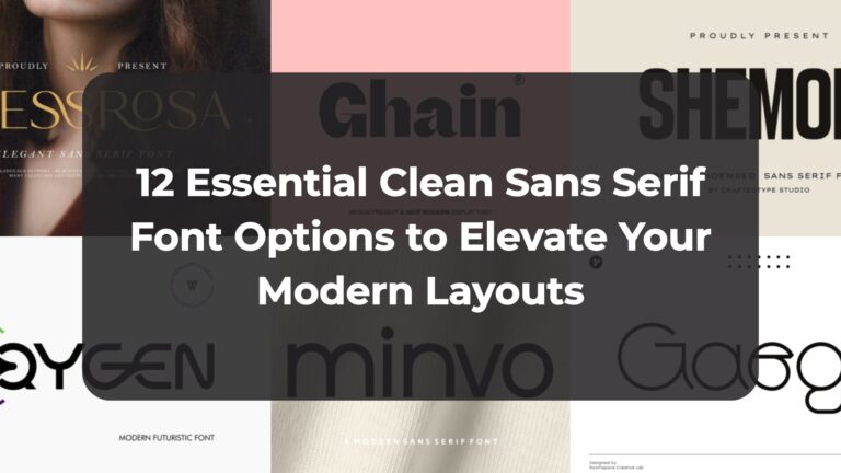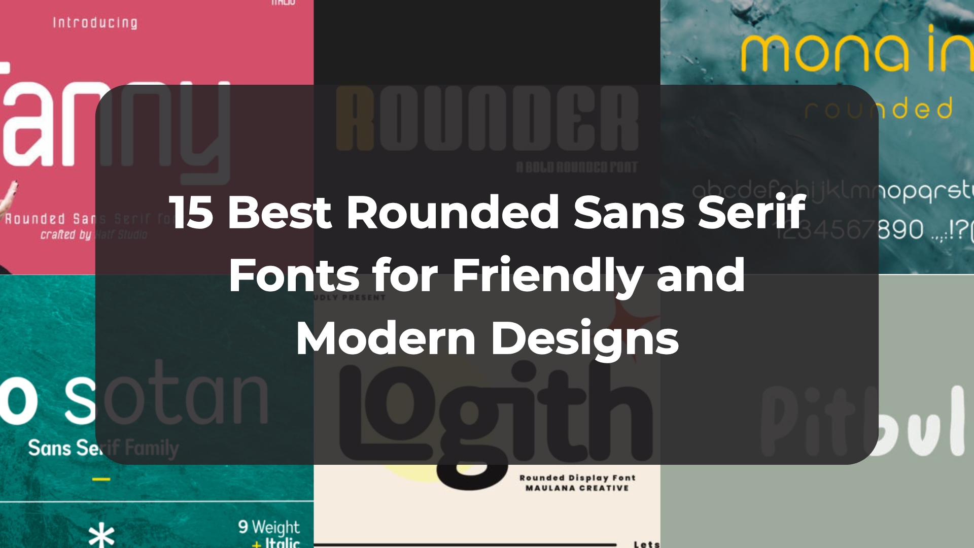
15 Best Rounded Sans Serif Fonts for Friendly and Modern Designs
Staring at a blank canvas trying to make your interface or brand identity feel completely approachable yet effortlessly sleek can be a real creative challenge. That is exactly why I have spent days curation-testing these incredibly fluid design assets. In this post, I am sharing 15 of my favorite choices to help you find the ultimate rounded sans serif font that will inject a soft, punchy, and confident energy straight into your next big layout.
1. Makio Rounded Sans Serif Font


Every time I want to inject an undeniable, friendly punch into a digital product or branding layout, I look for letterforms that strip away cold, sterile geometry. That is exactly why Makio has completely taken over my current inspiration boards. This incredible rounded sans serif font masterfully balances a massive visual presence with a remarkably soft, approachable character. The standout advantage of this typeface lies in its heavy, plump vertical blocks and perfectly pillowed corners. It gives your main display headers an incredibly solid, punchy posture, ensuring your text is highly scannable and full of confident, modern energy without looking overly aggressive.
My Recommendation: Use this heavy display typeface for vibrant tech startup branding, bold mobile interfaces, or contemporary packaging. To maximize its punchy visual weight, try setting your text in crisp white directly against a solid, electric blue or saturated neon background. Pairing its thick, tightly packed letter junctions with a clean, low-contrast linear sans for supporting copy creates an exceptional contrast that makes your total interface or print composition look flawlessly curated, professional, and ultra-modern.
2. Ragnir Rounded Sans Serif Font


Whenever a project calls for a massive burst of energy without losing its friendly soul, I look for typefaces that prioritize pure fun. That is exactly why the Ragnir Rounded Sans Serif Font has caught my eye. The core advantage of this vibrant rounded sans serif font lies in its chunky, ultra-bold letterforms mixed with soft curves. It delivers an incredible visual punch without losing flawless readability, giving your headers an expressive personality that instantly commands attention.
My Recommendation: Use this versatile typeface for playful brand identities, gaming graphics, or modern packaging. To unlock its full potential, letting its heavy characters shine by using high-contrast palettes like cream text over a deep purple backdrop is a must. Pairing its thick geometric stems with a minimal linear sans for subtext creates an exceptional visual contrast that keeps your total composition looking curated, professional, and ultra-modern.
3. Goodly Rounded Sans Serif Font


Sometimes, all a layout needs is a smooth geometric flow that perfectly captures that elusive sweet spot between contemporary sleekness and everyday friendliness. That is exactly why the Goodly Rounded Sans Serif Font family has become an asset I frequently return to for my visual concepts. The primary advantage of this incredibly polished rounded sans serif font lies in its clean loop connections and perfectly uniform line distribution. It effortlessly builds an easygoing yet highly professional posture, giving your custom logos and presentation titles a distinct, scannable clarity that instantly removes any harsh or sterile geometric angles.
My Recommendation: Use this six-weight typeface family for trendy product label packaging, creative brand identities, or minimalist posters. To truly let its interlocking contours capture the spotlight, let your main logotypes stand out in crisp white against a clean, deep charcoal or stark black canvas. Utilizing the medium weight for main titles and combining it with a thin weight variation for secondary details creates a gorgeous visual contrast that makes your total design layout look beautifully curated and premium.
4. Stampy Rounded Sans Serif Font


Finding a design asset that can effortlessly strike a balance between structural strength and an earthy, handmade soul is an absolute game-changer for text layouts. That is why the Stampy Rounded Sans Serif Font immediately grabbed a permanent spot in my font collection. The standout advantage of this uniquely textured rounded sans serif font lies in its organic, ink-stamped distressed look paired with two complete sets of alternate characters. These dual sets, combined with clever automatic ligatures for consecutive letters, prevent repetitive texture patterns. This ensures your high-impact titles retain a perfectly imperfect, authentic hand-crafted quality right out of the box.
My Recommendation: Use this weathered, heavy typeface for rugged outdoor product packaging, bold poster titles, or artisan food labels. To fully activate its vintage, tactile charm, try overlaying its pale green or warm neutral tones directly onto deep charcoal or dark, matte backdrops. Pairing these tall, distressed characters with a super-clean, geometric regular sans block below creates an exceptional visual contrast that makes your total display composition look beautifully curated, grounded, and professional.
5. Little Supply Rounded Sans Serif Font


Every single time I map out a brand concept that needs to feel incredibly modern, minimalist, and deeply approachable all at once, I crave letters with true structural clarity. That is exactly why Little Supply has captured my creative eye. The main advantage of this beautifully polished rounded sans serif font lies in its flawless geometric precision mixed with perfectly pillowed corners. It features thick, solid bars and a high x-height that give your headers a tight, highly cohesive visual footprint. It instantly eliminates traditional layout clutter, offering a soft, bold presence that is exceptionally scannable and full of friendly, contemporary energy.
My Recommendation: Deploy this ultra-modern typeface for high-impact tech startup branding, friendly mobile interfaces, or clean kids’ brand logos. To maximize its sleek geometric flow, try setting your text in solid black against a soft gray wave or minimalist white background with generous padding. Pairing its thick, continuous curves with a whisper-light linear sans-serif text block below creates an outstanding visual contrast that keeps your entire composition looking perfectly curated, professional, and timeless.
6. Macro Jecklin Rounded Sans Serif Font


If you are searching for a display typeface that effortlessly breathes an airy, modern architectural energy into your canvas, finding a solution that balances scale with softness is absolute key. That is precisely why Macro Jecklin has earned a permanent home in my master design library. The primary advantage of this stunning rounded sans serif font lies in its incredibly clean line construction combined with buttery, soft-edged terminals. It delivers a beautifully balanced visual footprint that feels structurally sound yet completely friendly and warm, ensuring your focal headlines retain a highly readable, contemporary posture without ever looking cold or industrial.
My Recommendation: Use this polished display typeface for upscale real estate brochures, modern lifestyle branding, or urban design portfolios. To let its expansive geometric flow truly command the layout, try overlaying its clean white letters directly onto warm, twilight architectural photography or subtle minimalist gradients with generous tracking. Pairing its thick, friendly stems with a tight block of light linear text below builds a breathtaking visual contrast that makes your total composition look exceptionally curated and professional.
7. Cingur Rounded Sans Serif Font


Every now and then, I stumble upon a typeface that instantly refreshes my entire design outlook with its sheer simplicity and playful spirit. That is exactly the kind of creative spark Cingur brings to the table. The primary advantage of this remarkably adaptable rounded sans serif font lies in its beautifully balanced heavy strokes and smooth, cornerless architecture. It infuses your headers with a fun, expressive character without ever compromising on clarity or structural weight. Plus, with expansive multilingual support covering over 100 languages and a handful of slick built-in ligatures, it serves as an incredibly stable, high-performance asset that makes setting clean title hierarchies an absolute breeze.
My Recommendation: Deploy this versatile typeface for modern logo designs, punchy movie titles, or engaging social media campaigns. To fully unlock its aesthetic power, try using it as a grounded secondary body font directly beneath an elegant handwritten script or a sharp vintage serif heading. Setting its crisp white strokes against a dark, matte charcoal background with generous tracking builds a timeless visual harmony that keeps your total editorial canvas looking incredibly curated, professional, and sophisticated.
8. Ostania Rounded Sans Serif Font


If you are on the hunt for a display typeface that effortlessly anchors a canvas while remaining incredibly approachable, finding an option with real structural backbone is absolute gold. That is exactly why Ostania has caught my attention and earned a premium spot in my active toolkit. The primary advantage of this assertive rounded sans serif font lies in its beautifully balanced, thick visual weight and masterfully smoothed terminals. It strips away cold, sharp geometry to give your main headings an incredibly solid, punchy posture, injecting an instant dose of modern energy and confidence into your text layouts without creating unnecessary visual noise.
My Recommendation: Deploy this bold, versatile typeface for high-impact social media title graphics, contemporary merchandise lines, or trendy app user interfaces. To let its chunky, rounded character shapes truly dominate the page hierarchy, try setting your text in crisp white directly against a deep, matte charcoal or solid black background with generous padding. Pairing its heavy geometric stems with a whisper-light linear sans-serif for secondary copy builds a flawless visual harmony that keeps your composition looking perfectly curated, professional, and timeless.
9. Grynchell Rounded Sans Serif Font


There is something completely refreshing about working with a layout that calls for a clean, minimalist spirit without feeling cold or detached, and that is exactly where this asset shines. The Grynchell Rounded Sans Serif Font has become one of my favorite discoveries for projects that need to feel light, airy, and effortlessly modern. The primary advantage of this beautiful rounded sans serif font lies in its incredibly clean line weight and perfectly uniform geometric curves. It strips away complex visual clutter to provide flawless readability, giving your display titles an elegant, friendly posture that feels highly sophisticated and welcoming at the very same time.
My Recommendation: Use this minimalist typeface for organic beauty packaging, contemporary book covers, or lifestyle magazine headers. To fully maximize its clean, lively spirit, try setting your text in crisp white and positioning it over vibrant, textured backgrounds or rich, natural grass greens. Keeping your layout open with generous whitespace and pairing these rounded strokes with an ultra-light, linear secondary text block creates a stunning visual harmony that keeps your entire composition looking perfectly curated, professional, and timeless.
10. Logith Rounded Sans Serif Font


Every single time I map out a fresh layout that requires a distinct, playful quirkiness without sacrificing modern professionalism, I look for letterforms with unexpected character geometry. That is precisely why the Logith typography option instantly caught my attention. The primary advantage of this modern rounded sans serif font lies in its heavy, uniform stroke weight and uniquely looped structural loops, especially on key lowercase letterforms. It strips away sharp, industrial corners to offer an incredibly friendly and readable posture, injecting a delightful spark of retro-futuristic charm into your primary headlines while maintaining flawless edge clarity and visual punch across any screen layout.
My Recommendation: Use this bold, expressive typeface for contemporary tech startup branding, creative podcast covers, or playful display posters. To let its unique looped geometry fully shine on the canvas, try setting your text headers in deep charcoal or dark brown overlaying minimal cream backdrops with a splash of retro orange accent graphics. Pairing its chunky stems with a whisper-light geometric linear sans for secondary details builds an exceptional visual contrast that makes your total design layout look beautifully curated, professional, and timeless.
11. Rounder Rounded Sans Serif Font


If you are searching for a display asset that injects an instant dose of industrial strength mixed with an approachable, friendly spirit, finding a typeface with proper structural density is absolute key. That is exactly why the Rounder typography option has caught my creative attention. The core advantage of this chunky rounded sans serif font lies in its tall, ultra-bold geometric proportions and masterfully curved outer corners. It takes the heavy, solid posture of classic athletic blocks and softens the edges, effortlessly giving your display headings a playful, energetic personality that brings any flat canvas to life without cluttering your visual composition.
My Recommendation: Deploy this heavy, tall typeface for creative sports merchandise, retro arcade graphics, or punchy streetwear logo designs. To make its massive structural letterforms truly pop on the screen or in print, try using an eye-catching split color palette—like accenting the first letter in bold mustard yellow and the rest in light gray against a dark, matte charcoal canvas. Pairing these blocky stems with a wide-spaced, minimal linear sans below builds an exceptional visual contrast that makes your total layout look curated, high-impact, and deeply professional.
12. Fanny Rounded Sans Serif Font


There is something absolutely magical about a typeface that captures the effortless, flowing charm of casual handwriting while maintaining a perfectly clean geometric perimeter. That is exactly why Fanny has managed to completely stand out in my master typography collection. The premier advantage of this versatile rounded sans serif font lies in its unique dual-style availability and its tall, smoothly rounded structural strokes. It strips away rigid, cold industrial lines to bring an inviting, human touch to your primary headers, providing incredible scannability and a refreshing visual energy that keeps your layout looking modern, stylish, and full of distinct personality.
My Recommendation: Deploy this beautiful, tall typeface for creative branding projects, contemporary product packaging, or chic media advertisements. To let its unique handwriting-inspired anatomy truly establish your page hierarchy, try setting its crisp white characters directly against a solid, vibrant mauve or deep pink canvas with a striking lifestyle portrait overlay. Pairing its thick, uniform curves with a whisper-light geometric regular sans font below creates an exceptional visual contrast that makes your total editorial composition look beautifully curated, expensive, and professional.
13. Pro Sotan Rounded Sans Serif Font


If you are on the lookout for an expansive, high-performance typographic system that brings an undeniable structural flexibility to your canvas, finding a family with true depth is an absolute dream. That is exactly why Pro Sotan has earned a permanent home in my master design workspace. The primary advantage of this incredibly versatile rounded sans serif font lies in its massive variety of weights and perfectly proportioned, smooth geometric curves. It completely strips away harsh, cold industrial angles to introduce a subtle, romantic softness into your presentation headings, providing an exceptionally clean visual posture that is highly readable and perfect for bringing any flat layout to life.
My Recommendation: Use this expansive typeface family for elegant brand identities, contemporary greeting cards, or bold editorial headers. To fully activate its elegant geometric flow, try utilizing its heavier weights for massive title sequences and pairing them with the light italic styles for your secondary subtext details. Setting your text in crisp white directly against a rich teal or deep marine textured backdrop builds a breathtaking visual harmony that instantly makes your total display composition look beautifully curated, expensive, and professional.
14. Mona Inn Rounded Sans Serif Font


Every now and then, you come across a typeface that completely masterminds the art of breathing clean, fluid tranquility directly into a busy digital interface or modern print asset. That is exactly why the Mona Inn typographic option has secured an absolute top spot on my personal recommendation list this season. The primary advantage of this incredibly polished rounded sans serif font lies in its ultra-clean, minimalist line architecture and uniform curve transitions. It completely strips away heavy typographic clutter, providing an effortlessly light, premium look that brings a friendly yet deeply sophisticated posture to your custom logos and headline hierarchies without loading the canvas with unnecessary bulk.
My Recommendation: Deploy this sleek, minimal typeface for premium organic skincare branding, contemporary t-shirt typography, or high-end product labels. To fully unlock its elegant fluid footprint, try setting your primary headings in a vibrant golden yellow or clean white over deep, glassy ocean water photography or rich textured backgrounds. Leaving ample whitespace around these slender characters and keeping your secondary subtext blocks highly linear creates a breathtaking visual harmony that makes your total design layout look expertly curated, expensive, and professional.
15. Pitbull Rounded Sans Serif Font


Finding a display typeface that injects an authentic, hand-drawn warmth into a canvas without looking messy is a true joy. That is why Pitbull has earned a spot in my active toolkit. The main advantage of this playful rounded sans serif font lies in its softly irregular, organic outlines and perfectly smoothed terminals. It completely strips away cold, sterile vector paths to offer a deeply friendly visual presence, giving your custom logos an incredibly soft yet confidently bold posture that instantly connects with an audience.
My Recommendation: Deploy this organic, friendly typeface for cozy kids’ branding, cute apparel items, or playful product labels. To unlock its full charm, try setting these characters in crisp white directly over a matte sage green backdrop. Pairing its chunky, hand-modeled stems with an ultra-clean, minimal secondary text block builds a gorgeous visual contrast that keeps your total layout looking beautifully curated, warm, and professional.
Conclusion
Choosing the right typography is all about giving your modern digital or print concepts a warm, distinct personality that naturally connects with people. I truly hope this handpicked collection guides you straight to the perfect rounded sans serif font to balance and anchor your next brand identity, application interface, or packaging design. Drop a comment down below to let me know which of these 15 options stolen your heart, and let’s keep creating together!